01 — Case study
B2B Design System
A white-label product where every client got their own brand and nobody got their own codebase. I built the system that made that work: tokens, components, specs, and the approval gate around them. And I built the argument that got it funded before I built any of it.
The problem, measured
The product is a B2B SaaS sales-engagement platform sold to large enterprises and deployed under each client’s own brand. Quizzes, performance indicators, an activity feed, challenges with real rewards (money, physical, points), a coaching module. Roughly fifty client deployments were live. The product team was ten to fifteen people, I was the lead designer.
Nothing was a component and nothing was a token. Every screen was drawn again. There were around 25 types of buttons. Every client onboarding meant re-deriving layouts that already existed somewhere in a file, and every change meant finding all the places that pattern had been copied to.
I knew that was expensive. I did not know by how much, so I went and counted. I had a year of my own task log (every design task, with hours against it) and I split it by what the time had actually gone into.
Logged design effort, the twelve months before the system
513 tasks · 2,011 hours
~33% rework
- 362h for Redesign
- Work delivered, then rebuilt
- 301h For Review
- Checking consistency by hand
- 1,348h Actual work
- Everything else
Roughly a third of my design effort was spent doing work that had already been done once. That is the number the whole project rests on, and it is the only pre-build figure here that is a measurement rather than a model.
The pitch
I did not propose a design system. I costed one.
I took the rework hours, applied the loaded rate for a designer and for the front-end
developers downstream of every ambiguous handoff, and modelled what the problem was costing
per year if nothing changed: roughly $13k in design time and roughly $58.5k in
development time, about $70k a year in total. Then I put a deck in front of the founders
and the engineering leads with that number on the first slide, followed by the pilot
project, the tooling, and the rollout plan.
They approved it. I built the first version over about a year alongside product work, and then maintained and extended it for six more.
The hardest part of a design system is not the components. It is getting permission to spend a year on something that will not ship a feature.
What I built
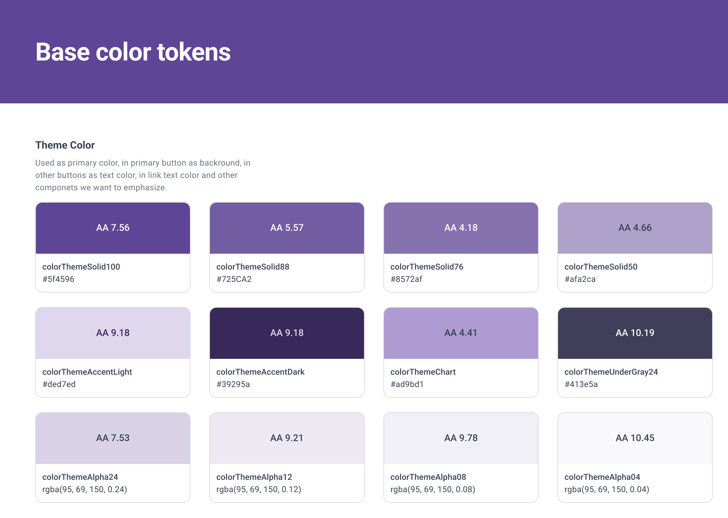
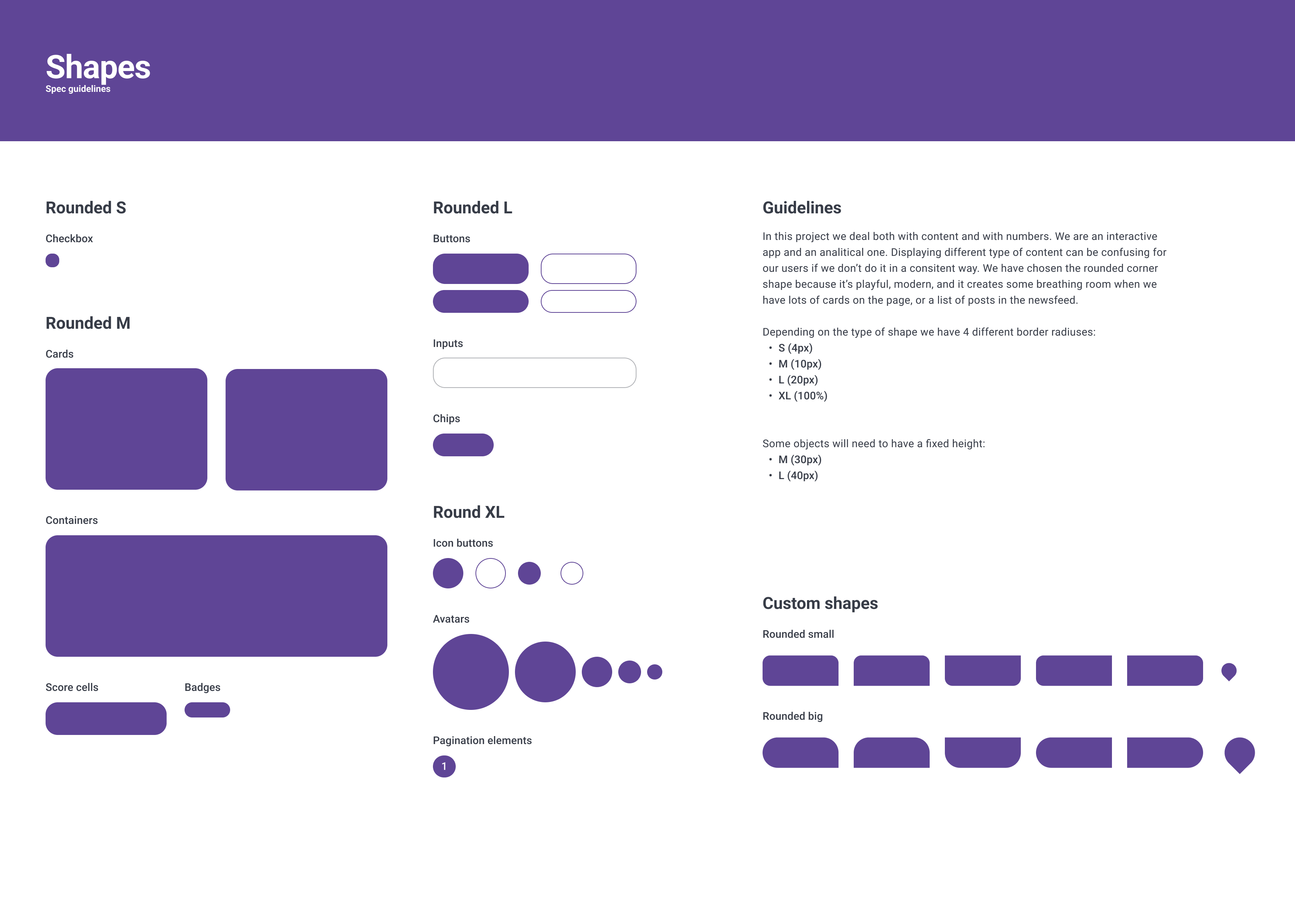
167 design tokens in a single collection: colour across fourteen semantic groups, an eight-step spacing scale, icon sizes, border radii. All of them primitive. There was never a semantic layer over the top, and I would build one differently today. More on that at the end.
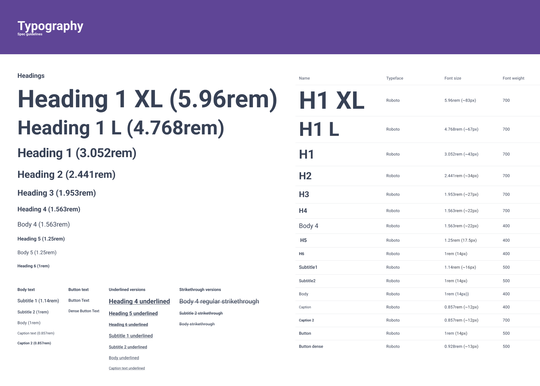
135 reusable components on top of that, organised as a strict atomic hierarchy, plus a full icon set of about 361. Text, paint, effect and grid styles layered alongside the variables so that consumers who could not read a variable still landed on the same values.
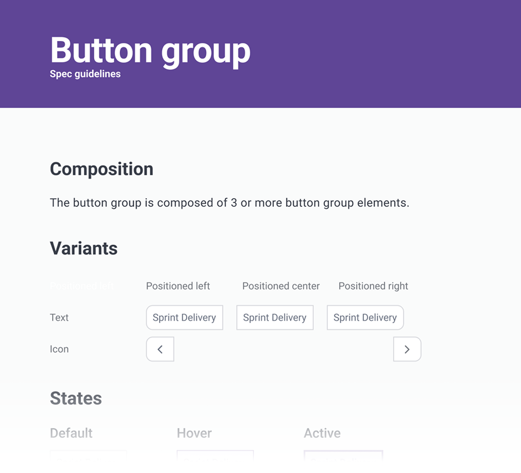
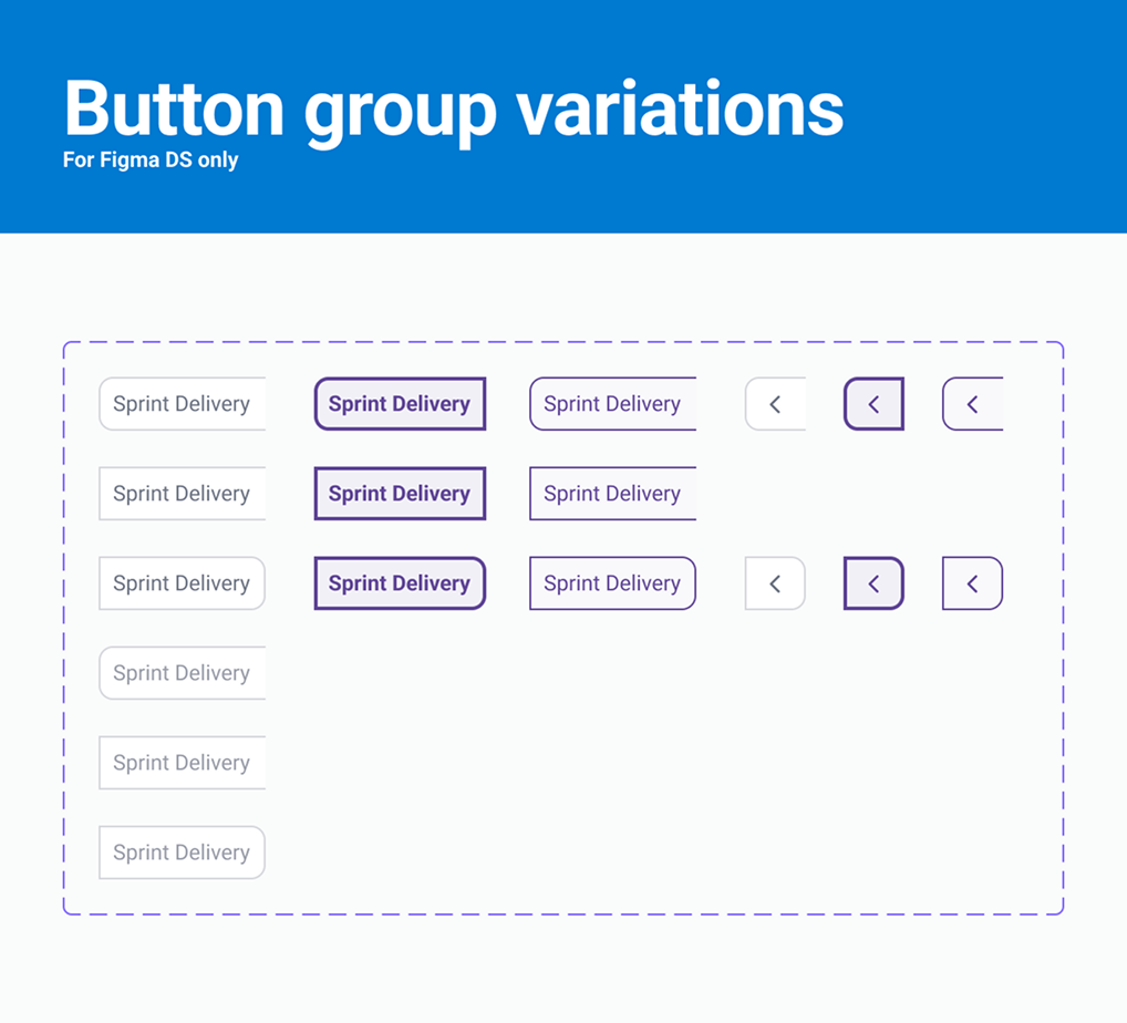
The part that mattered more than the count: every component page paired a spec frame with a variants frame. The variants frame showed every state the component could be in. The spec frame said what each state was for, which token drove it, what the interaction rules were, and what it must never be used for. That template was the same on every page in the library, which is what made it possible for a developer to open any component and know where to look.
How one library carried many brands
People assume this part wrong, so it is worth being precise.
White-label usually means a fork: a branch, a theme file, or a whole component set per client. That scales badly and it is the reason multi-brand products end up with design debt that nobody can pay down. It is not what we did.
Shared by every deployment
- 167 tokens Colour, spacing, icon size, radius. One collection.
- 135 components Atoms, molecules, organisms. One library.
- Type, grid, elevation Styles layered over the variables.
Set per deployment
theme-color Plus a logo. That is the whole per-client surface — the components, the spacing and the type never fork.
Result
~50
branded deployments on one component set, one of them running eighteen country instances of its own.
A single theme-color token, plus a derived ramp of solid mixes, alpha variants and accent
shades, carried the client’s brand through every surface that needed it. One component set
served every deployment. Onboarding a new client meant setting a colour and uploading a
logo, not opening the library.
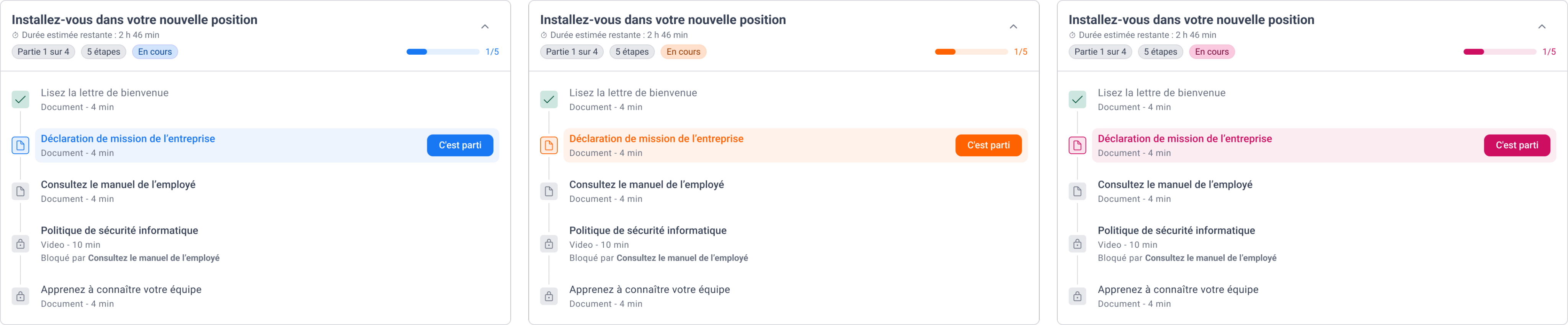
The limit of that approach is real and I would rather name it than let an interviewer find it: one theme colour is not a brand. It cannot carry a client’s typography, their radius language, or a second brand colour. It was the right trade for this product and it would be the wrong trade for a design system serving genuinely distinct brands.
Governance that survived contact
A library is not a system. What made this one hold for six years was the loop around it, and the loop had a gate in it.
-
01
Component review
Weekly · design, CTO, lead dev
An agreed decision that a component is needed, changed, or refused
-
02
Design and spec
Me
The component in the library, plus a written spec in the tracker
-
03
Implementation
Front-end
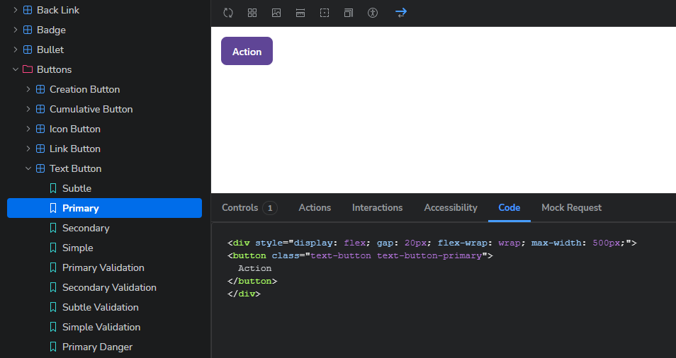
The component in Storybook, the developers’ source of truth
-
04
Review and approval
Me, against the spec
Approved, or sent back with what does not match
-
05
Published
—
Available to every deployment at once
A component that does not match its spec goes back to step 3. That gate is the reason the library and the code did not drift apart over six years. Everything else in this diagram is just a diagram.
Two things about this are worth saying plainly, because they are the difference between a governed system and a Figma file with good intentions:
The weekly review was cross-functional and it had authority to say no. New components were refused there regularly, usually because an existing one covered the case. That meeting is where a library stops growing without limit.
The approval step was mine and it was against a written spec, not against my memory of what I had drawn. That means the spec had to be good enough to settle a disagreement, and that requirement is what kept the spec frames honest.
What held, and what did not
Six years. Dozens of client onboardings. No rewrite.
The system is still in production and still being extended. It absorbed a coaching module, a training-programs module, a redesigned dashboard and a navigation overhaul without being rebuilt. That is the only durability test that means anything.
The thing that did not hold was elevation. The system separated surfaces with box-shadow,
everywhere, as its default and only boundary. That was a defensible 2019 decision and by 2025
it was a problem: shadow-only separation fails non-text contrast under WCAG, and it was
costing paint time on dense screens. So I migrated most of the library off shadows onto tonal
separation with a light accessible border, on a live system, without breaking fifty
deployments. That migration became two case studies of its own — the epic that retired
the shadows, and the instrument that came out of the question it raised.
What was never measured
What I would do differently
Instrument it on day one. The absence above is a choice I made by not making it. Even a crude quarterly count of detached instances would have been worth more than the estimate I now decline to give.
Build the semantic layer. 167 primitives with no aliases meant every consumer bound directly to a raw value. It worked, and it made the later theming work harder than it needed to be. When I built the next system I built the semantic layer first: 138 primitives with 83 semantic tokens over them. True dark mode came almost free.
Write the specs earlier. The spec template arrived after the first thirty or so components and I retro-fitted the rest. The components that were designed against the template from the start are visibly better, because writing down what a state is for catches states that should not exist.