06 — Case study
A design system that checks itself
Tactical interfaces look great and are hard to read. I wanted to know whether a system could keep the look and still pass accessibility, and whether I could direct an AI to build it without losing the details. Both answers came out the same way: trust nobody, me included, and make the build do the checking.
What this is, and what it is not
Division DS is a concept. There is no client, no user and no brief except mine. I built it as one piece that shows three things together: that I can design a system, that I can direct an AI to build one properly, and that accessibility can be something the build enforces instead of something a designer promises.
I directed and designed it. Claude Code wrote the TypeScript and the React. I did not write the code by hand, and I would rather say that here than have you find out in an interview. What I did was decide what to build, in what order and to what standard, and then review what came back. That turned out to be most of the work.
Every number on this page was counted from the repository, not remembered. Where a number is weak, I say so next to it.
The tension I picked on purpose
Tactical interfaces get their look from one move: a hard orange on a dark, smoked ground, with bright text sitting on it. I sampled a reference and measured it. White text on that orange came out at 2.80:1. WCAG AA asks for 4.5:1. Near-black text on the same orange measured 7.20:1.
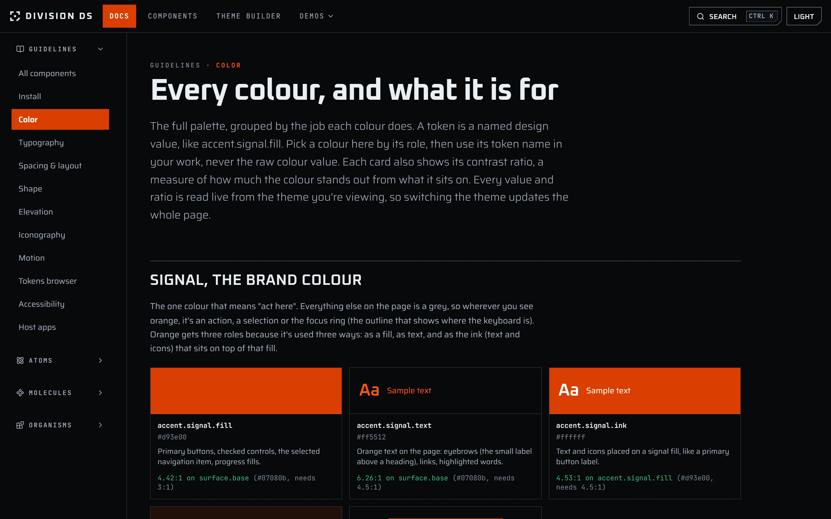
So the most recognisable part of the style fails the first test it meets. The usual fix is to darken the orange until white passes, and I was afraid the look would go with it. So I went the other way for most of the build: a brighter orange, #f2550f, with a dark label on top. White measured 3.45:1 on it and the dark ink 5.85:1.
While rewriting this study I measured again and tried a deeper orange, #d93e00. I liked it, and the look survived. White on it measures 4.53:1, which passes AA with almost nothing to spare, and the dark ink drops to 4.46:1, which fails. So I changed the whole system to #d93e00 with white labels. The rule never changed: measure the label against the fill and use the one that passes. That is the reason to make it a rule instead of a tuned value.
4.53:1
White on the signal orange
Passes AA, which needs 4.5:1
4.46:1
Dark ink on the signal orange
Fails
Inspired by, not copied
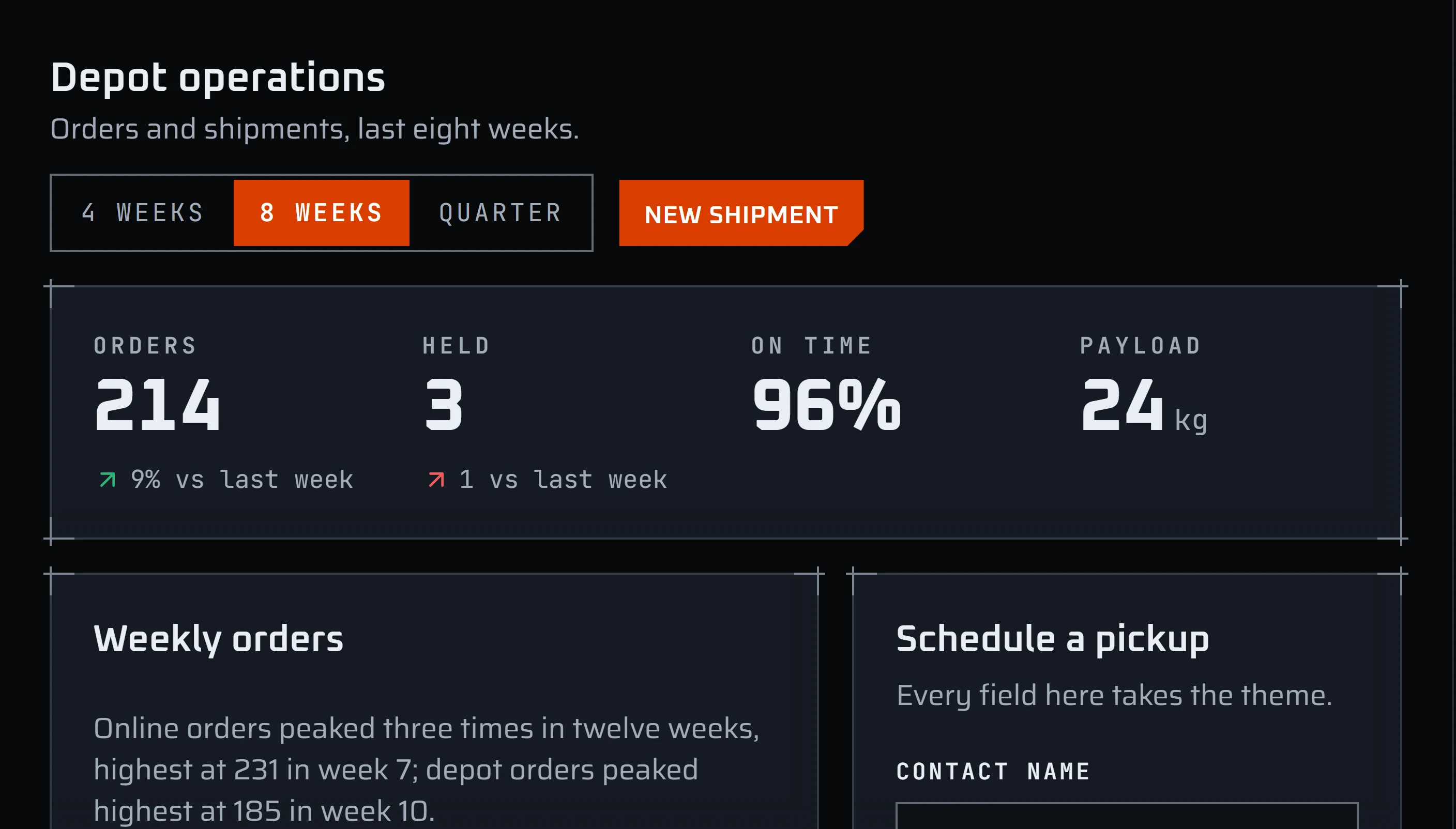
The look comes from the interface of a tactical shooter video game. I wrote down eight rules I could observe: one loud colour, selection as a fill, hairline panels with corner ticks, numerals as heroes with dimmed leading zeros, state that has a shape and never rests on colour alone. Then I rebuilt each as CSS, from the rule, without cropping or tracing anything.
A visual grammar is free to learn from. The game’s own assets are someone else’s intellectual property. So I took the grammar and left everything the studio owns: every logo and mark, the proprietary typeface, the game’s vocabulary, the controller glyphs. Copying those would be an IP violation, and that is a legal line, not a matter of taste. The fonts are open-licence (Oxanium, Saira, JetBrains Mono). The icons come from an MIT-licensed library. The corner mark is a crosshair of my own where the original used a solid square. The orange is deliberately not the sample’s. The reference images stay private. One more thing stayed out as a design choice, not a legal one: tilting panels on dense screens.
I wrote that legal stance down in two documents on day one and it still failed. Game vocabulary reached four public pages while both documents forbade it. One of them even said, on a public page, that there was a source whose marks the system avoided, which invites exactly the question the rule exists to prevent. A review pass found it, not my memory of the rule. So the IP rule is a build gate now. It scans the source for a list of banned words and fails the build, naming the file, the line and the word. I broke it on purpose before I trusted it.
Tokens: three layers, and a gate that mattered more than the values
There are 192 tokens, in three layers.
The first layer, primitives, holds the raw values: 66 colours, 8 spacing sizes and 6 motion timings. The colours come as ramps. A ramp is one hue in eleven steps from lightest to darkest, and there are six of them: the orange, a neutral grey, and one for each status (success, warning, error, information). The second layer, 86 semantic tokens, gives those values a job, like surface.base for the page background or text.primary for body text. Thirty of them arrived in 0.7.0: ten label colours, each with a fill, an ink and a text role. The third layer, 26 component tokens, gives individual controls values of their own to adjust.
The ramps are generated, not picked. Each hue has one anchor value, and the script derives eleven stops from it with the anchor landing unedited at stop 500. A test checks that the stops are strictly ordered and that the hue never drifts.
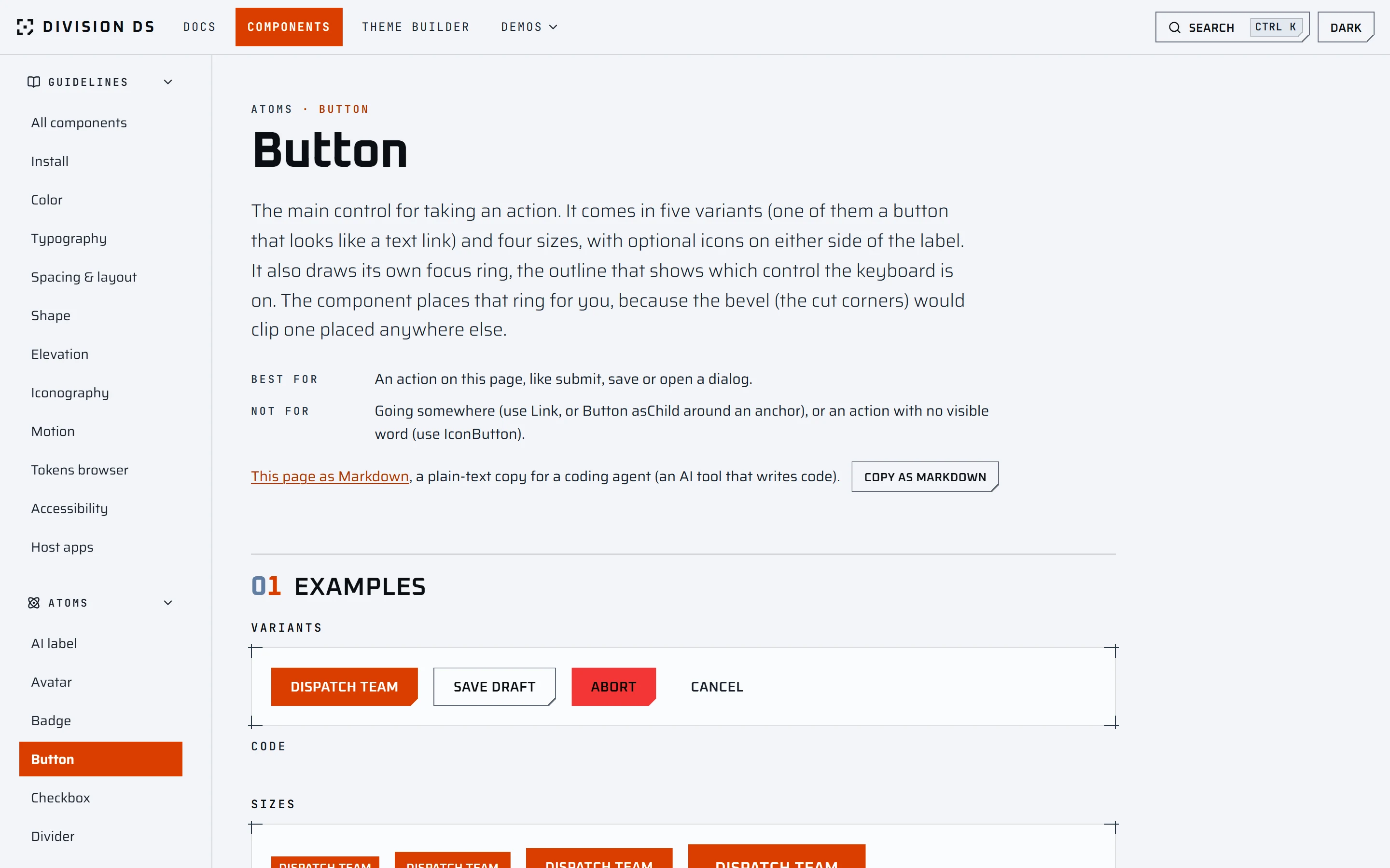
Every state colour splits into three roles. Fill is the solid block and does not change between themes. Ink is the text that sits on a fill: white on the orange, dark on the status colours. Text is that colour used as text on a normal surface, and this one has to adapt. The light theme proves the tokens are semantic and not renamed hex values: for the same role it needs a different ramp step.
Signal orange as text uses ramp step 400 in the dark theme, at 6.26:1. In the light theme the same role uses step 600, at 5.73:1, a darker step where the dark theme needs a lighter one, because step 500 reaches only 4.42:1 and 4.11:1 on those pages. Warning amber needs two steps of change, not one: step 800 at 6.34:1, since step 700 reaches only 3.56:1.
The contrast gate checks 148 pairs in both themes, 296 measurements, and the build fails on any miss. It composites translucent colours over the surface they sit on instead of measuring their nominal value.
The most useful thing that gate ever did was embarrass me. My first version listed fourteen pairs by hand per theme, and none of them was a form control. When a review finally measured the boundary of a checkbox, a radio and a switch in the off position, it was 2.27:1 at best in the dark theme and 1.12:1 in the light one. Those three controls had no other visual saying they existed. The fix was not a darker hairline, because that token also draws decoration. It was a separate token for boundaries that carry information, and a gate that follows the component layer’s own references, so pointing a control back at the decorative hairline fails the build.
75 components, each a small package
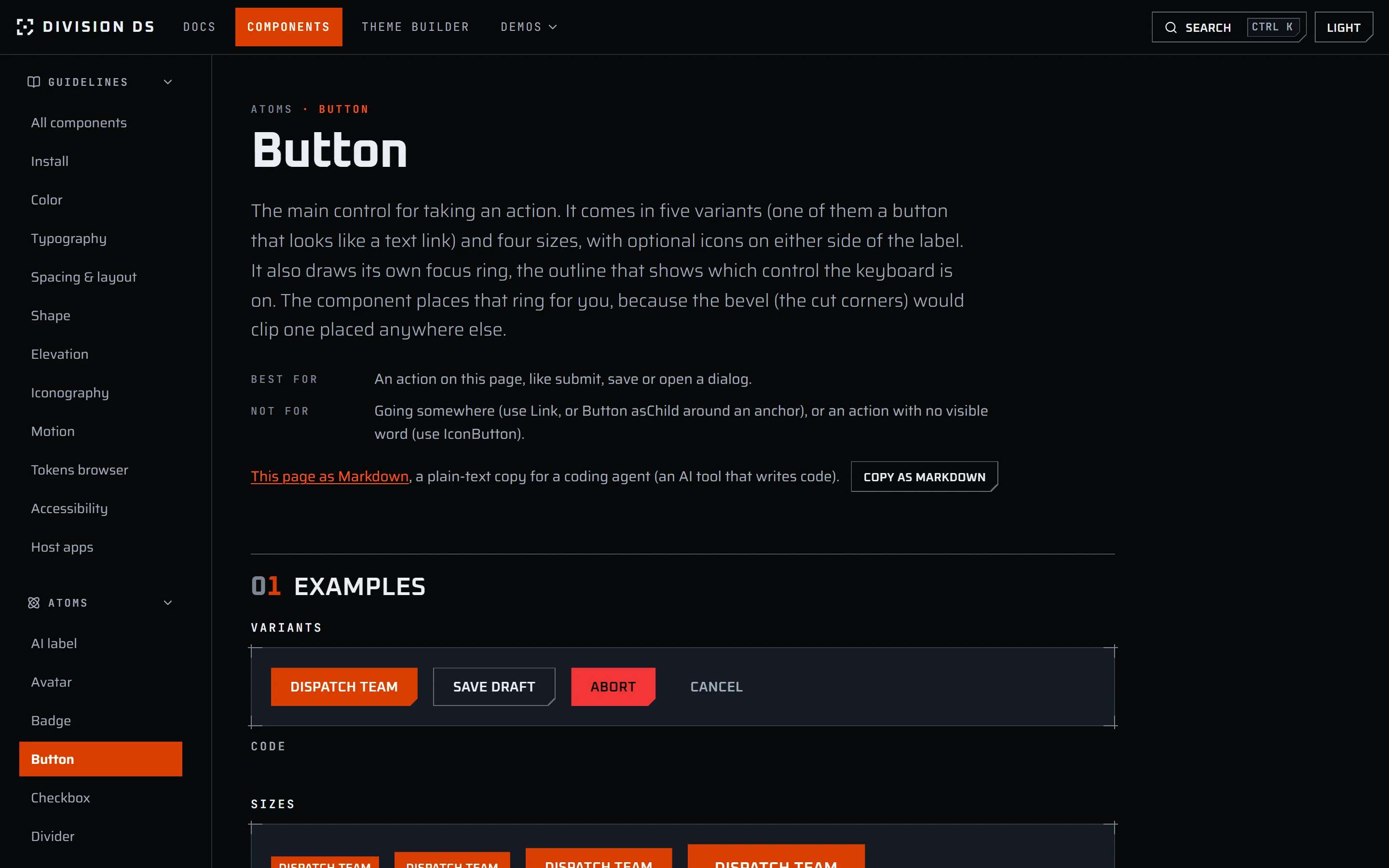
There are 24 atoms, 33 molecules and 18 organisms, on React 19, Radix for behaviour, Tailwind 4 and class-variance-authority for variants. Each component is a folder with four files: the component, its tests, one metadata file, and a documentation page. The page covers anatomy, props, keyboard behaviour, and what to do and not do.
One principle ran through all of it: the component owns the rule. If someone using it can forget a rule, the rule is in the wrong place. The focus ring wrapper is rendered by the component, not requested. The accessible name on an icon button is a required prop, so leaving it out does not compile.
The cut corners are the hard case. The style uses clip-path for its bevels, and clip-path clips anything painted outside the shape, including a focus ring. I found that while reading two open-source sci-fi UI libraries, neither of which mentions accessibility in its README. It became a written rule: the ring is drawn on a wrapper outside the clip, never inset. A test reads the computed styles to hold it.
Three products on one system
A system is only believable under load, so I built three apps on it from the same components the documentation shows.
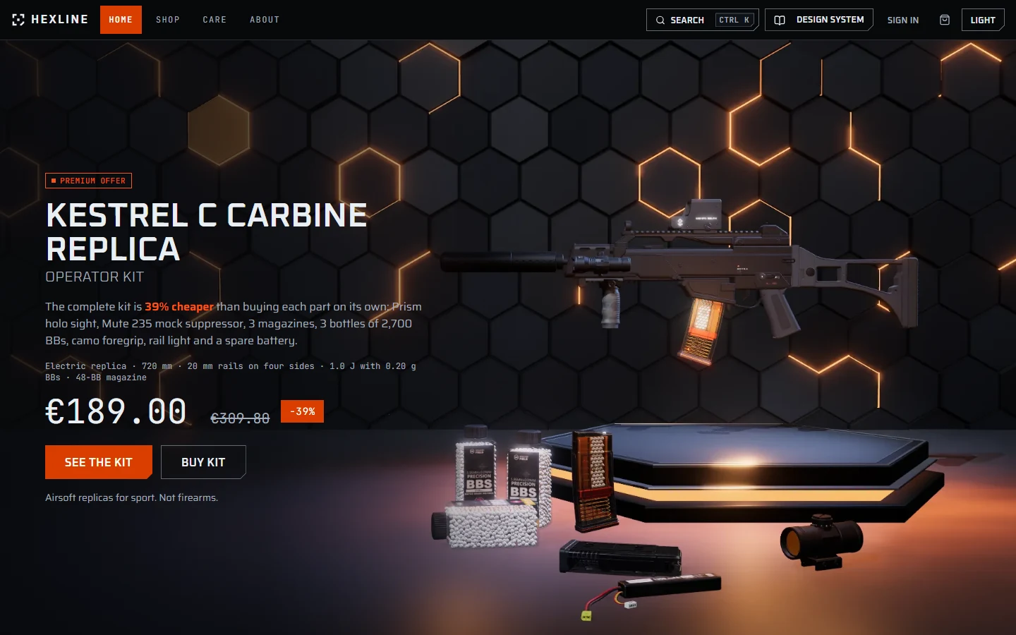
Hexline is a fictional airsoft replica shop: a catalogue, product pages, cart, checkout in three steps, an account area, a blog of care guides, and a back-office. The homepage hero is a three.js scene drawn entirely in code, with no model files and no textures. The picture on every product card is rendered from that product’s own 3D model. Under reduced motion, save-data or without WebGL, a still fills the same box and the page works the same.
It was not the first plan. The store began as an outdoor-gear shop with scroll-scrubbed video heroes. The footage was never shot, and I replaced the concept and the hero together. Every name in the shop is invented, the pictures show products on a stage and never aimed or fired, and every page that shows a product carries one fixed sentence: “Airsoft replicas for sport. Not firearms.” A test checks that the sentence renders where it should.
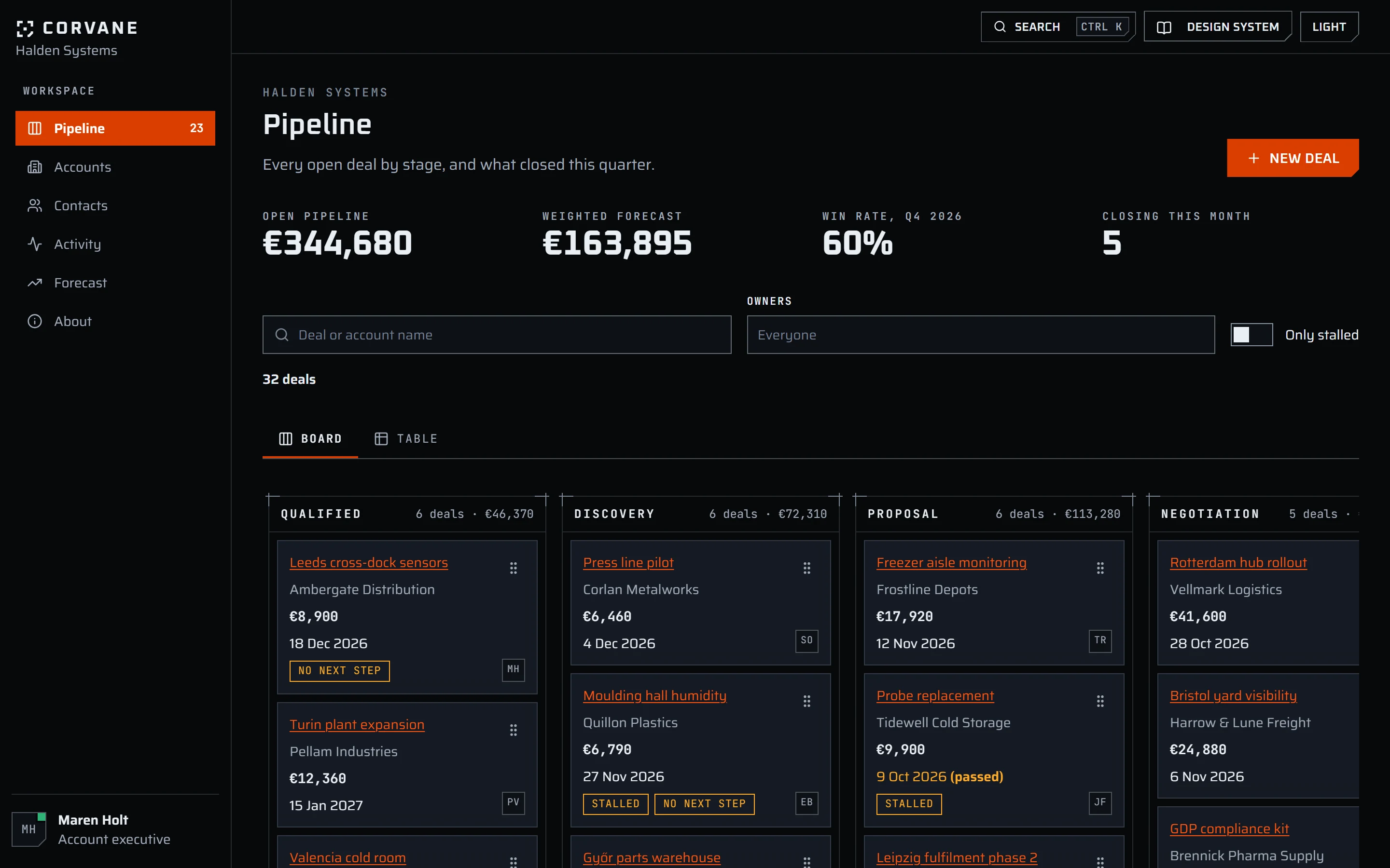
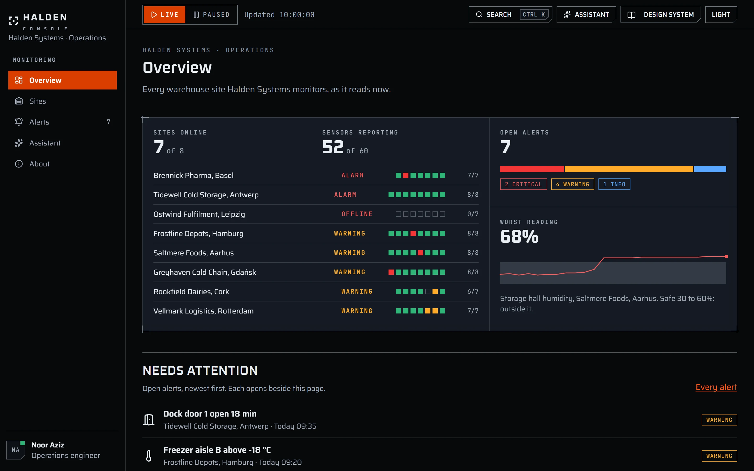
Corvane is a sales CRM with a pipeline board, an account view and a forecast. Halden Console is a monitoring product with a live sensor view and an AI assistant panel. That assistant is scripted. No model is called. It is there to show that the system has the pieces an AI interface needs: a streaming message, a tool call, an approval request.
What working with an AI actually looked like
The loop was the same every time. A plan with the gates written into it, built in small tasks, each task reviewed, and fix rounds until the review was clean. The build log runs to more than fifteen thousand lines because I asked for every decision and every rejected option to be written down as it happened.
What I learned is that an agent saying “green” is not evidence of anything. Four examples, all from the log:
- A check that could not see its own failure. The rule that three.js never lands in a chunk every page loads was checked by one command that someone had to remember, and it printed 0. Then I deliberately added a static import and ran it again. It still printed 0, because the bundler had put three.js in a chunk next to the entry, preloaded by it, instead of inside it. The rule is now a build gate that follows every chunk the entry loads. Broken on purpose, it fails and names the chunk.
- An assertion that could not fail. A regular expression written through the tooling landed in a test file as a literal backspace character instead of a word boundary. The test looked right in the logs and could never go red. It was found only by running the break.
- Tables kept by hand for three weeks. When I added a test comparing every props table with the component’s real TypeScript props, its first run found fifteen disagreements in five components.
- Layout shift on every lazy page. Pages loaded on demand showed a one-line fallback, and the footer sat under it and was thrown down the screen when the page arrived. Measured with a delayed route, the shift on the shop page was 0.673, on a product page 0.744. A minimum height on the main area took every one of eight routes I measured to 0.000, and eight tests now hold it.
A check I have not watched fail is not a check. Every gate here was broken on purpose before I believed it.
My part was the decisions and the taste. Some of those decisions went against the numbers. With the earlier, brighter orange, I kept it for the selected radio and the signal progress bar in the light theme, at 2.15:1 against their surroundings, below the 3:1 non-text contrast bar. For the progress bar I had two passing alternatives in front of me and chose the orange anyway. The later move to #d93e00 took both to 3.68:1, so those exceptions are gone and the gate now holds them at 3:1.
Making the system readable to an agent
Near the end I asked a different question: what would make this system easy for an AI agent to use correctly? I read the documentation of eighteen production design systems, shadcn’s in full, and sorted what they ship into eight things: checks an agent can run, machine-readable docs, a small set of tools, a rules file and a skill, correct and wrong code side by side, metadata generated from source, a registry, and tokens that state their intent.
Division DS already had typed components and clean tokens. What it lacked was any way for an agent to find that out. Its documentation was a client-rendered app, so a fetch returned an empty page. I built the missing parts:
- Generated markdown for every component, an
llms.txtindex and split bundles, 94 files today, checked by a test that fails when any is stale. - One metadata file per component that the docs page and the markdown both come from, and a test holding each props table against the real types.
- A sentence on every token saying when to use it.
AGENTS.mdas the entry point, with the rules written once and copied into the skill.npm run verify, one command that runs six of the seven gates, the type-check and the tests. The seventh checks the finished build, so it runs after every build.- A public repository and a shadcn registry, so the skill and each component install with one command. The install page has them.
Then I measured whether any of it helped. The honest result is smaller than I hoped, because the baseline was already clean. Before any of this work, eight screens written by an agent with the whole repository had zero type errors and zero invented colours. A capable agent with typed source and a compiler does not need telling how to write correct code. The work could not make agents more correct.
It changed other things. Eight screens written from the generated docs alone, with no access to the source, also compiled with zero type errors. Before, that test could not be run at all. Agents stopped reading the 2,914-line design document (eight of eight before, none after) and read the generated pages instead, with 13% fewer tokens in the latest round than the first baseline.
The agents also taught me things the research had not:
- Nobody ran the verify command. Six of eight gave the same reason unprompted: they had been told not to modify other files, and verify regenerated files. A check that writes is a check an agent under instructions will not run. It now writes nothing.
- One of my rules was wrong. “A Select goes inside a FormField” is false for a Select repeated on every row of a list. Two agents broke it correctly and said why.
- A documentation bug turned up three times. A props table listed a prop on the wrong component. It survived every unit test and the manifest check, and only the agents that read the docs alone tripped on it.
Twenty-six other systems, and what I took from them
In late October I went looking for what other teams do about AI. A site called designsystemsrepo.ai keeps a list of 26 design systems that ship AI features, from IBM’s Carbon and Amazon’s Cloudscape to the guidelines Anthropic and OpenAI publish for apps that run inside their chat products. Seven research agents read them, plus shadcn’s theme creator and a guide to building Figma libraries for agents. I dropped every idea Division DS already covered. Ten were left, and I had all ten built.
A tool server that checks code
When I first wrote this page I had ruled out a tool server, because every system I had read that ships one maintains it as a separate product. The survey changed my mind. A tool server here means an MCP server. MCP, the Model Context Protocol, is a standard way for an AI assistant such as Claude Code or Cursor to plug into an outside tool and call it while it works. Six of the systems ship one: shadcn, Chakra, Dialtone, Blade, Vibe and Atlassian. All six let an agent list components, search them and read their docs. None of them checks the code the agent has just written.
Division DS already had that check. division-ds check flags raw colours, invented token names, buttons with no gap between them and props a component does not take. So the server went into the same npm package, as npx division-ds mcp, with eight tools. The one that matters is validate_code. It runs exactly the same function as division-ds check, so the two can never disagree. It added no dependency.
Apps that live inside Claude and ChatGPT
Claude and ChatGPT can now show small apps inside a conversation. Ask for a flight and a booking card appears in the chat, with dates, prices and a button. The airline builds the card; the chat product shows it. The chat product is called the host. It sends the card its own colours and fonts, so the card can look like part of the conversation.
A card built with Division DS would ignore them and arrive dark and orange in the middle of Claude’s chat. Reading the specification turned up something worse. Two of Claude’s colour names are the same as Division’s, --color-text-primary and --color-text-secondary, and the host’s values win. A Division screen whose theme does not follow the host’s could end up with Claude’s dark text on Division’s dark page. I worked that out from the CSS; I have not seen it happen in a host.
The fix is an adapter: one setting, data-host="mcp", and the components take the host’s colours and fonts, falling back to Division’s own. The host’s guidelines also limit those in-chat cards to two actions, no scrolling inside and no menus, so division-ds check now flags a card that breaks the limits. A demo page shows the same card in Division’s look and in a simulated Claude look, side by side. And the Halden Console assistant now shows one in use: in its cold-room investigation, a card from Dockline, an invented dock-scheduling app, lists today’s deliveries to that dock and offers one action. It is scripted like the rest of that assistant, and since the console is built on Division DS too, the card looks native there.
A theme builder that refuses an unreadable theme
shadcn lets you pick your colours on a web page and get a short code for the result. I built the same for Division, with one difference. The Theme Builder runs the contrast gate in the browser, the same code the build runs, and only gives you the CSS when every measurement passes. If a pair fails, it says which one and by how much.
It also told me something I did not want to hear. Most accent colours failed: blue and green 7 checks each, yellow 21. My first fix let the builder slide a failing colour to a darker shade of the same hue until it passed. Every theme passed, and a yellow brand got mustard buttons. The builder was choosing someone’s brand colour for them.
The better fix was to split the accent in two. One token is the brand colour exactly as chosen, for buttons and badges. The builder never moves it; it only picks black or white text to sit on it. The other is the colour that alone shows a state: a ticked checkbox, a progress bar, the current page in a menu. Only that one moves, and only when the chosen colour is too faint to see. The earlier orange moved in one place: the light theme’s focus ring went a shade darker, from 3.14:1 to 4.51:1, because every keyboard user depends on it. The current orange needs no move in the builder, and the light theme’s ring is the brand colour itself, at 4.11:1.
The same tokens are also packaged as a shadcn theme, which installs into a shadcn project with one command.
AI states and AI wording
From Carbon: three AI colour tokens, in both themes and inside the contrast gate, and an AI-filled state on Input and Textarea. While the field holds the value the AI wrote, it is marked and screen readers hear “Filled by AI”. Once a person edits it, it looks normal again and offers “Revert to suggestion”. From Carbon and GitLab: an AiLabel that marks AI content and, when clicked, says why to check it and what it was made from. From Cloudscape: thumbs up and down on a reply, with Cloudscape’s own wording, and suggested prompts a person can edit before sending.
From Intuit, GitLab and Cloudscape: rules for the words around an assistant. A button never says “AI”. The assistant’s output is a response, not an answer. No “please”, no exclamation marks. The mechanical ones are a check. Run over the repository it read 479 button labels and 73 assistant labels and found nothing, which is what I wanted before trusting it on anyone else’s code.
Getting it in front of agents
division-ds skill copies the agent skill into a project, in the folders Claude Code, Cursor and Codex read. A generated DESIGN.md puts the tokens, the components and the rules in one short file for tools that take a single design file. Every component page has a Copy as Markdown button, for pasting a page into a chat.
A Figma library, and a wall
The Figma file now has 137 variables, light and dark, and 11 components with 101 variants, named exactly like the code’s props. A gate compares a snapshot of the Figma file with the code and fails when they drift. Code Connect, Figma’s feature that links each Figma component to its code, did not happen. Figma refused: “Code connections can only be made in libraries that are in Organization or Enterprise plans.” My plan is Professional. The mapping files are written but have never been through Figma’s own parser.
How it was built, and the best evidence it works
Seven agents worked in parallel, each in its own copy of the repository. A separate reviewer read each one’s changes cold, with three questions: is it correct, does anything here go unused, and does every number in the write-up match real output. The reviewers found real bugs. The shadcn theme would have turned every hover in someone’s app orange. The rule summaries in llms.txt were cut off mid-sentence. The Figma gate let a mapping read a property Figma does not have.
The best evidence came when the branches were merged, because nobody planted it. The Figma gate failed on its first combined run: the AI work had added three colour tokens and the Figma file did not have them. The new wording check failed on the AI work’s own button, which first read “Revert to AI suggestion”. And the Copy as Markdown button broke a browser test that had always hovered the first button on the Tooltip page. Each gate caught another agent’s work, which is the job I built them for.
A stranger tried it
Then I let a stranger try it. A fresh Claude Code session, in a folder with no access to the repository, got one brief: build a trip planner for a hiking club using only the MCP server and the public docs, and keep an honest log. It built the app and scored the system 7 out of 10 for “could a stranger build this”. It lost the points on finding things, not on the components. The thumbs up and down for an assistant’s reply lived on the ChatMessage page, and nothing pointed there. The search answered “page background” with the wrong token. Both are fixed. One caveat: the agent never connected the server the way a real assistant does. It wrote its own small client to call it, so the log proved the tools answer correctly, not how they behave inside Claude. A later run closed that: a headless Claude Code session with only the published server connected built a booking form with the new date picker and scored the server 8 out of 10. Its three complaints, all about wording in the docs, are fixed.
When I opened the app it built, the trip date was a plain text box. The system had no date picker, and its own rules told agents to use the browser’s.
A date picker, in four parts
Now it has one. You type a date into three slots, day, month and year, in the order your language writes them, and the cursor moves on by itself; the arrow keys change a slot. Nobody can type the 31st of February. A button in the field opens a calendar you can drive entirely from the keyboard, and a screen reader hears each day as a full date, not a number. The value is a plain date with no time zone, so it cannot slip to the day before for someone in New York.
It comes in four parts, each installed on its own: the date picker, a range picker with two months side by side, a list of presets such as Last 7 days, and a time field. A project that needs one date installs one part. That took the system to 72 components.
Search, and a claim that was not true
The docs site got a search box in the top bar. It ranks pages, components, props and tokens with the same code the MCP server uses, so a person and an agent typing the same words get the same answer. To keep it in reach, the top bar became sticky.
That fixed something I had not noticed. The accessibility page claimed the top bar stayed pinned while you scroll, so that keyboard focus never hides under it. It did not; the bar scrolled away with the page. The claim became true the day the bar became sticky, and a browser test now checks it. The same page listed three other rules as promises for flows that did not exist yet. By now they did, so I checked each against the real components and marked them shipped, with the evidence written next to each.
A front door
Until late October the site opened on the documentation. A system that says it is ready to use should look it, so it got a homepage at the root of the site, built only from its own components.
The hero is a drawing of a filing cabinet. Each folder in it is a component: an unseen pointer opens the bottom drawer’s folders one by one, a file rises out of each with a sketch of that component printed on it, and a terminal beside it types the command that installs it. Move your own pointer over the cabinet and it follows you instead. It is drawn with Hairline, an open-source (MIT) engine for isometric line figures by Lucas Markes, and its colours are Division’s tokens, so it changes with the theme. Under reduced motion it holds still.
Building the homepage turned up three components the system was missing, because I kept writing the same markup by hand: a Panel, the bordered box with corner ticks; a CodeBlock with a title bar and a copy button, now used for every code sample on the site; and a smaller key cap for keyboard shortcuts. Every page now shares one header, with the same height and the same 16-pixel side margin. A components page lists all 74 alphabetically, filtered by level.
The theme builder moved out of the documentation into a page of its own, like shadcn’s: the controls on the left, a live dashboard in the middle, and the contrast checks on the right. It also learned to turn the cut corners off. Pick a radius from none to round, and the buttons, fields, checkboxes, switches and segmented controls round off with it, the small controls by a third as much.
Two fixes from that work are worth telling. In the light theme the input background sat too far from the page, so fields looked heavy. Moving that one token closer took the boundary of a control from 3.49:1 to 4.56:1 against it, and all 180 measurements still pass. And every button on the site draws corner brackets when you point at it. At rest they waited, invisible, 12 pixels outside the button, and inside a scrolling sidebar that invisible box was enough to make a scrollbar appear. No test caught it. I saw it on the screen.
A real terminal
A terminal is the one thing in this system that had to wrap someone else’s engine. I want to watch Claude Code agents work inside a command centre I’m building, and type to them directly, and that needs real terminal behaviour: colour, cursor movement, full-screen programs. So the 75th component wraps xterm.js, the open-source terminal that runs in a browser. It shows output and reports what you type. It knows nothing about the connection, which stays in the app. Output goes straight to the terminal instead of through React, so a fast stream never redraws the page around it.
Three problems were worth the time. xterm’s screen reader mode reads every line aloud, which is useless with an agent printing hundreds of them, so I kept the rows a screen reader can browse and turned the reading off by default. Only the status gets announced: connecting, live, exited with code 2. Tab and Escape belong to the program inside a terminal, which makes it a keyboard trap, so Ctrl+Shift+L moves focus out and the title bar says so. And programs can ask for any colour, including ones you can’t read, so the 16 standard terminal colours became 17 new tokens, the last being the selection colour. All 16 clear 4.5:1 in both themes, which means “black” is a grey in the dark theme. Colours a program sends directly are corrected to the same ratio as they’re drawn.
It costs about 100 kB of JavaScript gzipped, so it’s the one component left out of the shared import file, and screens that don’t use it never download it. The Figma gate caught the new tokens the same way it caught the AI ones, and the build stayed red until the variables existed in Figma.
Its limits so far: the tests use sample output and a real browser. It has not yet run against Claude Code itself or a real screen reader.
What I can and cannot claim
It is built to WCAG 2.2 AA with automated contrast, axe, keyboard and reflow checks, in both themes. I do not claim it is AA conformant. Nobody has run it through a screen reader. It has not been checked in Safari or Firefox. The 3D viewer’s touch gestures have not been tried on a real touch screen. The rule about what the shop’s pictures may show is held by review, because no test can see a picture. A secondary button’s border nested two panels deep sits at 2.86:1 in the dark theme, and one animation dips under 3:1 at the trough of its cycle.
It is also a concept. It has no users, so I make no claim about adoption or about outcomes. I measured its first-load script on the day I wrote this: the documentation site’s entry chunk was 1,014 kB (283 kB gzipped) because every docs page was bundled into it. Splitting each page into its own chunk brought it to 367 kB (115 kB gzipped).
The newest work has gaps of its own, listed at the end of the section before this one: the Figma mapping is unpublished, and the adapter for Claude and ChatGPT has been tried in Claude Desktop but not in ChatGPT.
75
Components
24 atoms, 33 molecules, 18 organisms
148
Contrast pairs
296 measurements, both themes, build fails on a miss
2,469
Unit tests
36 skipped, 192 files
7
Build gates
contrast, vocabulary, button spacing, token discipline, agent docs, Figma sync, chunks