05 — Case study
Branded neutrals, without breaking contrast
Tinting a neutral scale with a client's brand hue is a one-line change that quietly breaks accessibility on some hues and not on others. There is no way to find out which ones without checking every client, and there were 322 of them. So I stopped trying to ship a palette and built something that could measure one instead.
Where this came from
The design system separated every surface in the product with a drop shadow. Cards, modals, panels, dropdowns: a shadow was the only thing telling you one plane sat on another.
Reasonable when it was decided, a problem by the time I looked at it again. A shadow gives non-text contrast nothing to measure, it cost paint time on dense dashboards, and over the years the shadows had multiplied into a set of near-identical elevations nobody could tell apart.
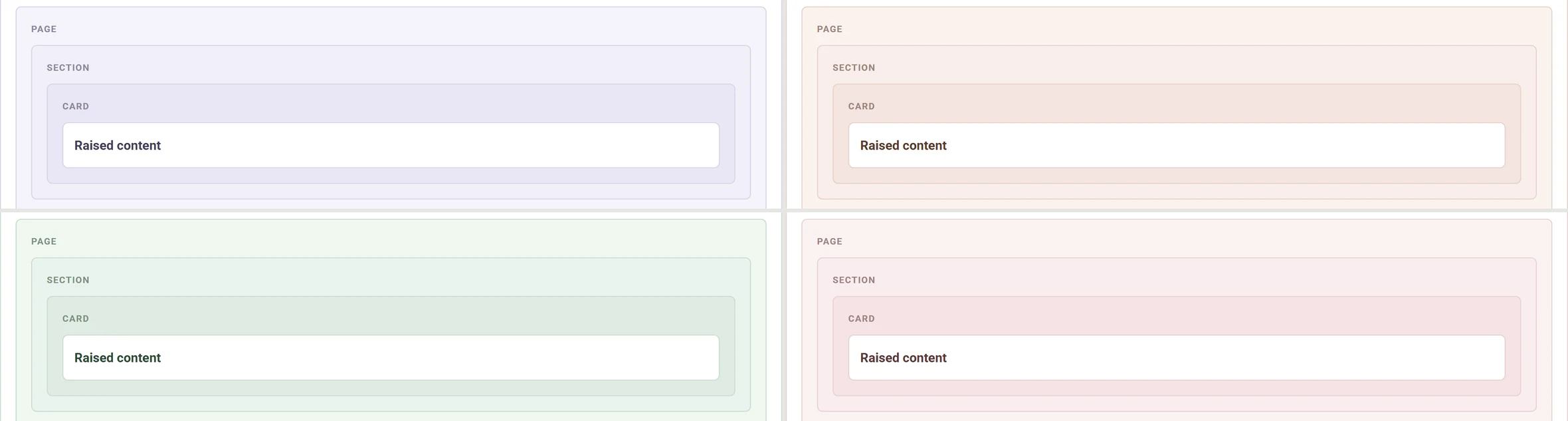
So I opened an epic to replace elevation with tonal separation: surfaces set apart by a step of the neutral scale and a one-pixel border, with the tone doing the separating and the border sharpening it. That shipped as phase one and I migrated most of the library onto it.
Which raises the question phase two exists to answer. If surfaces are separated by tone now, and every client of this product configures their own brand colour, should that tone carry the client’s brand?
The obvious implementation is wrong
Every client set a theme colour. Not most of them. All of them. It was the first thing configured on a new deployment and the only thing that made the product feel like theirs rather than ours. The neutrals it sat on belonged to nobody.
The obvious fix is to mix a little brand colour into each grey. Most people reach for HSL to do it, and in HSL that goes wrong in a way that is easy to miss and hard to track down, because HSL’s lightness is not perceived lightness.
HSL · lightness 50% at every hue
The yellow reads as bright and the blue as dark. Same declared lightness, very different perceived lightness — so a contrast rule that holds for one of these hues does not hold for the next.
OKLCH · lightness 0.65 at every hue
Squint and the row reads as one tone. That evenness is the whole reason the transform is safe to automate: one set of contrast rules survives the entire hue circle.
That is what makes it dangerous instead of merely imprecise. A tinted background that passes contrast comfortably for a client with a blue brand can fail for a client with a yellow one, at the identical declared lightness, from the identical line of code. Nothing in the implementation looks wrong. It is wrong per tenant, and you find out from whichever client happens to complain.
The transform
OKLCH is perceptually uniform. Its L really does track how bright a colour looks, all the way around the hue circle. So the transform holds L, takes H from the client’s theme colour, and raises C by a hand-tuned amount at each step. Holding L is the invariant the rest of it rests on. Touch it and every guarantee downstream goes with it.
CSS relative colour syntax does the hue extraction in the browser, so there is no JavaScript anywhere in the colour path, no build step, nothing to precompute per tenant:
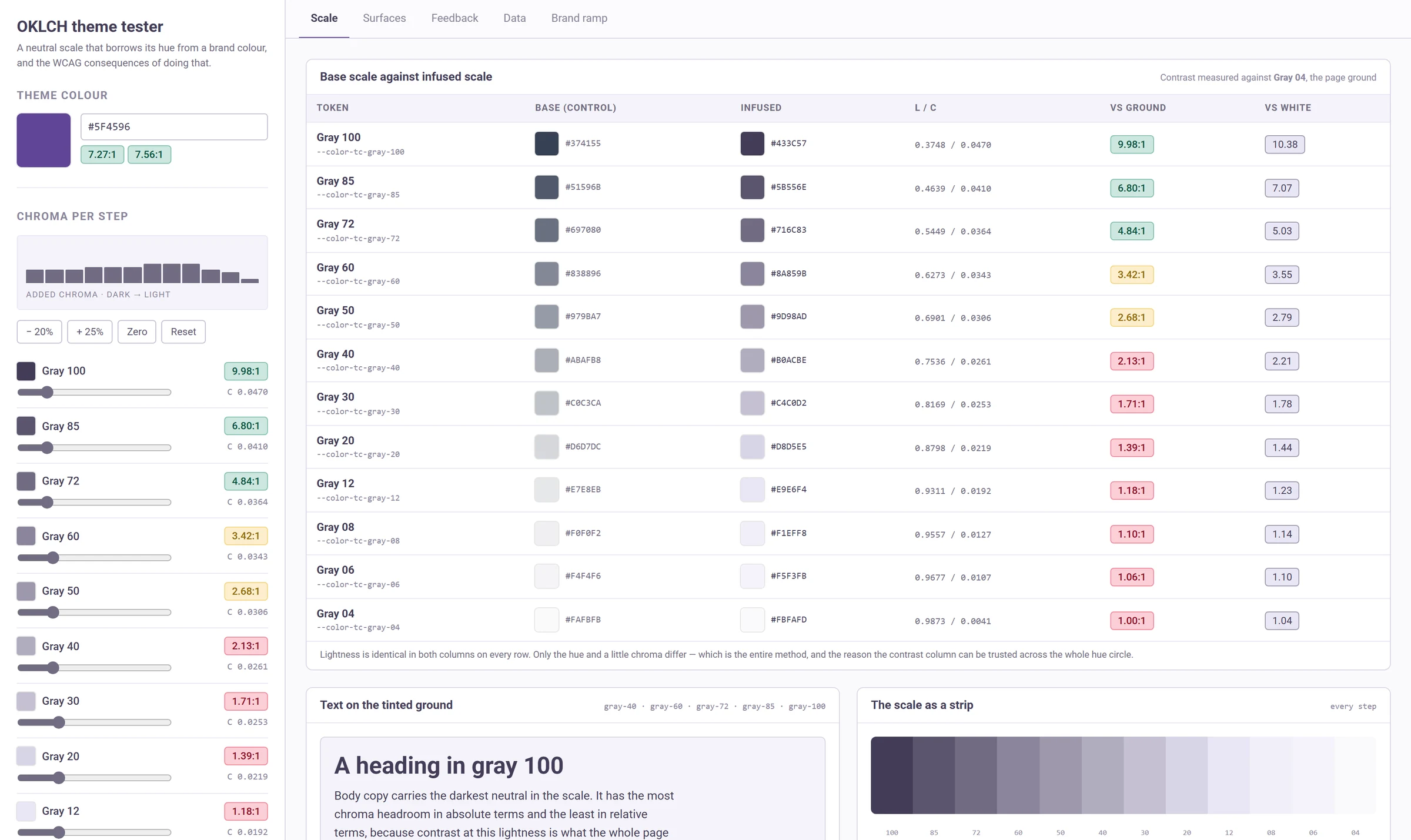
--color-tc-gray-100: oklch(from var(--theme-color) 0.3748 0.047 h);One custom property changes and the entire product recolours.
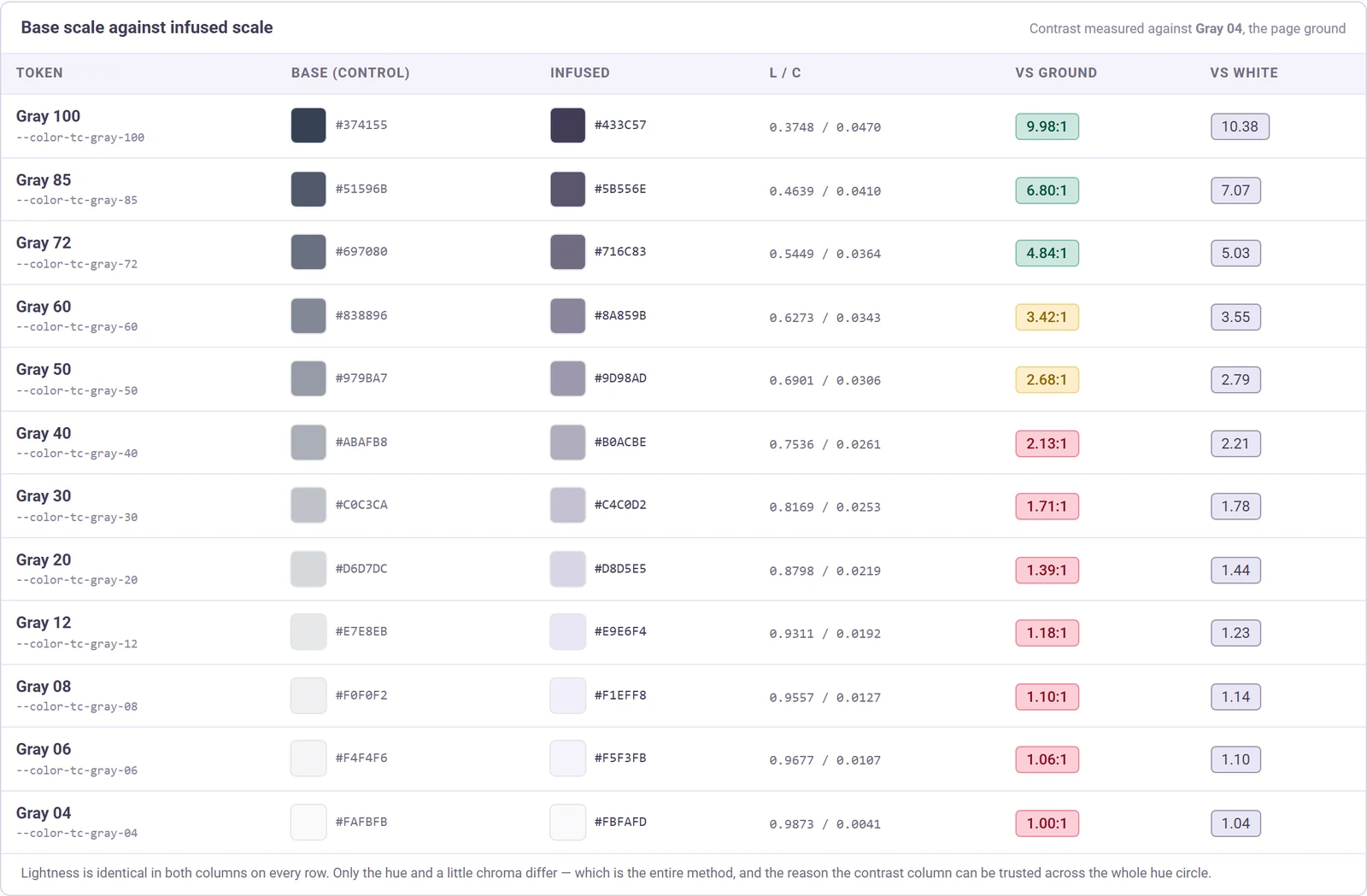
| Step | Tinted | Lightness | Base C | Added C | Final C |
|---|---|---|---|---|---|
| Gray 100 | 0.3748 | 0.0370 | 0.0470 | ||
| Gray 85 | 0.4639 | 0.0310 | 0.0410 | ||
| Gray 72 | 0.5449 | 0.0264 | 0.0364 | ||
| Gray 60 | 0.6273 | 0.0218 | 0.0343 | ||
| Gray 50 | 0.6901 | 0.0181 | 0.0306 | ||
| Gray 40 | 0.7536 | 0.0136 | 0.0261 | ||
| Gray 30 | 0.8169 | 0.0103 | 0.0253 | ||
| Gray 20 | 0.8798 | 0.0069 | 0.0219 | ||
| Gray 12 | 0.9311 | 0.0042 | 0.0192 | ||
| Gray 08 | 0.9557 | 0.0027 | 0.0127 | ||
| Gray 06 | 0.9677 | 0.0027 | 0.0107 | ||
| Gray 04 | 0.9873 | 0.0011 | 0.0041 |
Lightness column is locked · hue comes from the client · swatches use one demonstration hue
The middle column is the design work. Everything else is arithmetic.
The added chroma is not uniform, and the shape of the curve is the actual contribution.
Light backgrounds start almost perfectly neutral, so they need comparatively more chroma before the tint registers as anything at all. Text greys need less, because chroma at those lightnesses eats straight into the contrast ratio the text depends on. And the very lightest step needs least of all: any chroma on a near-white page ground stops reading as a tint and starts reading as a colour cast.
Get the curve wrong in one direction and nobody can see the change you just made to their product. Get it wrong in the other and the whole thing looks like a monitor with a bad profile.
Why a tool, and not a palette
I could have picked three brand colours, checked those, and shipped a recommendation. That would have been indefensible, and I knew roughly how indefensible because I could count. The platform carried 322 distinct client theme colours across its deployments.
Three hundred and twenty-two hues, twelve neutral steps, two contrast references each. That is not a thing you eyeball.
322
Distinct theme colours
Colours, not clients. A single client often runs several deployments with different ones.
12
Neutral steps
Each measured against the page ground and against white.
2.5 / 4.5
Badge thresholds
Under 2.5 fails everything. 4.5 and over passes AA for body text.
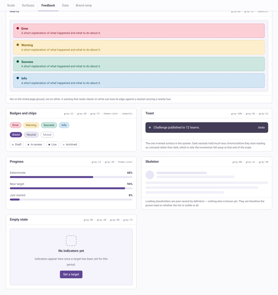
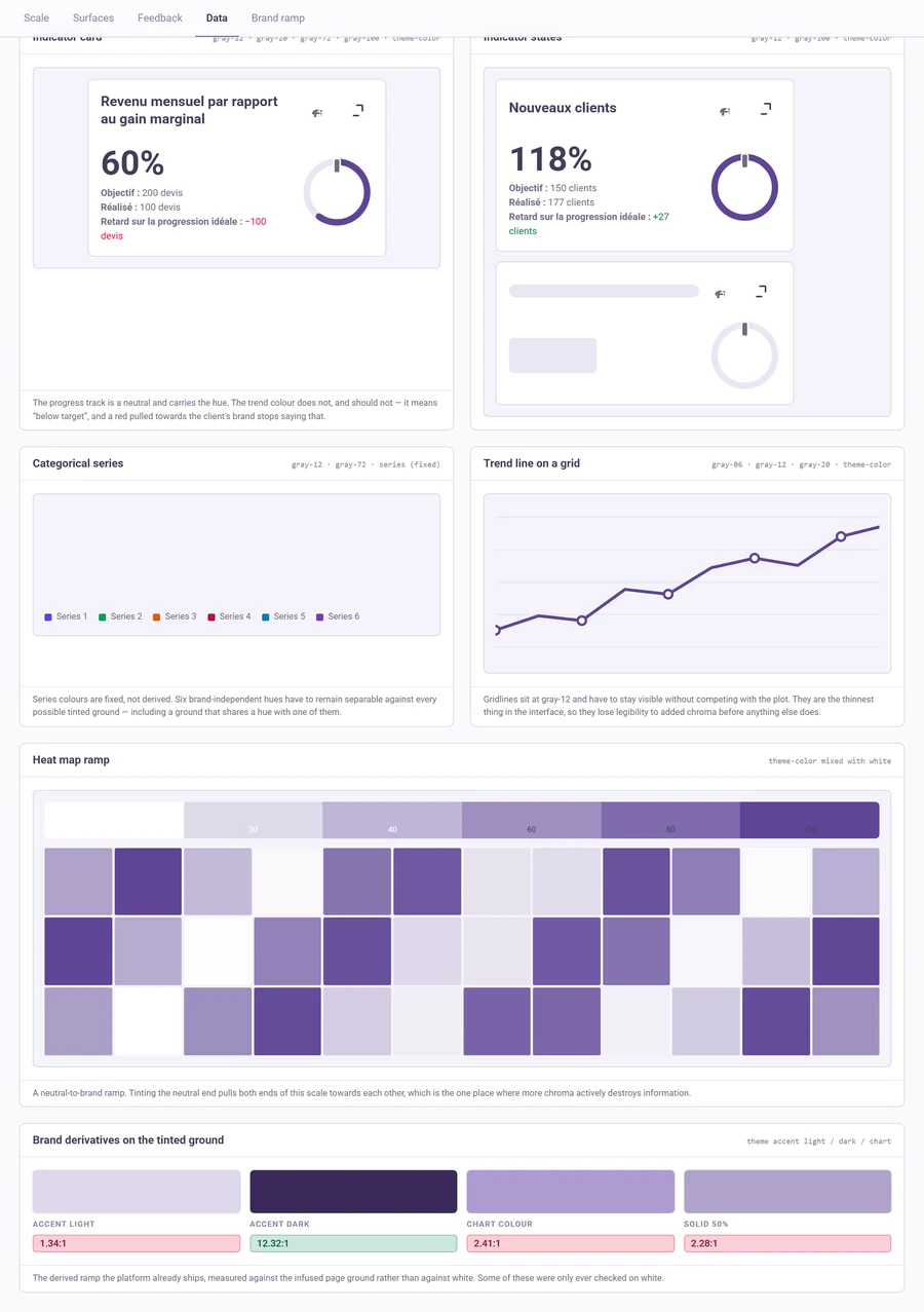
So I built a live model of the proposed token system instead. Every neutral, every derived brand shade, and a page rendered entirely in the result, all driven from one hex input, with a WCAG readout on every swatch.
Then I made the input a URL parameter.
What I changed when I extended it
The version that ran during the engagement answered one question well. Before putting it out publicly I widened it, and two of the changes were fixes rather than features.
The contrast reference was stale. Every ratio in the tool was measured against a hardcoded page-ground colour, and that colour’s chroma had been lowered during calibration months earlier without anybody updating the constant. The tool was measuring against a background it was not rendering. The error was small, because chroma barely moves luminance. It was still an accessibility instrument reporting on the wrong surface, so the ground is now read off the scale and cannot drift again.
The control group was mislabelled. The untouched greys sat under a heading that said “slightly changed”. They had not been changed at all. That column is the control, and mislabelling it undercuts the only comparison in the tool that matters.
The fallback was specified but never built. Relative colour syntax needs a recent browser. The design document called for graceful degradation to the base greys and the prototype did not have any. It does now, as a feature query, so an older browser gets a correctly coloured product that simply is not branded.
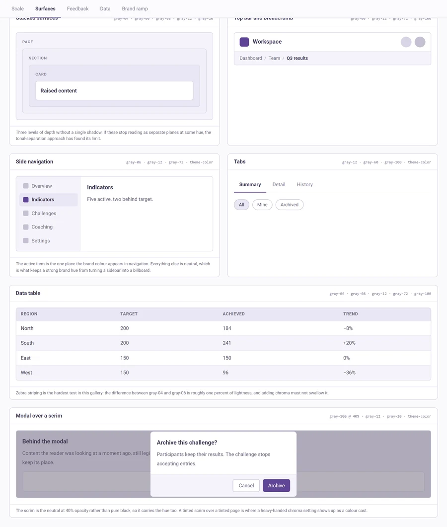
Then the additions. Component galleries for surfaces, feedback and data visualisation, which are the three families where a tinted neutral actually fails. A slider per step, so the curve can be argued with rather than taken on faith. And an import panel, because the method is not specific to one design system and the tool should not be either. Paste your own neutral ramp and it gets the same analysis.
How it was built
I prototyped it in Figma Make over three and a half months. The shape of those prompts matters more than their number.
The first version mixed colours in OKLab. I added a toggle so I could see OKLab and OKLCH side by side, looked at both, and removed the toggle along with OKLab.
Then four rounds of calibration, each one a short prompt from me followed by twelve
lines of exact oklch() values I had worked out myself.
That is the part worth being precise about, because “built with AI” invites the assumption that the AI made the decisions. It did not. Every chroma value in this system came from me, four times over, until the tint read as a tint rather than a stain. What the AI did was collapse the distance between deciding a number and seeing it applied across a whole interface, from a morning of editing variables down to about ninety seconds. That is a real saving and I will take it. It is also a different thing from design judgement, and I would rather say so than let the tool take credit for the work.
When the hosted prototype went offline, I exported it and rebuilt it as a standalone
Vite app. The export did not run. It was TypeScript in a .jsx file, importing four
modules that had not been exported with it. I recovered the missing components by
opening the Figma Make archive as a zip and replaying the session’s file-write calls
in order.
It was turned down
I would make the same proposal again, and I understand why it lost. Winning it needed a different kind of evidence from the kind I had. Contrast ratios prove that something is safe to build. They say nothing about whether anyone wants it, and the people who could have settled that were the clients. I never put it in front of them.
The instrument outlived the decision, which I did not expect at the time. The method is not specific to that design system, so I widened the tool to take any neutral ramp and put it out publicly. It carries the original scale by default; paste your own and it will analyse that instead.
What I would do differently
Automate the check instead of enabling it. A URL parameter turned 322 colours into 322 clicks. The right end state is a test that walks the same list and fails a build, which was sitting on the next-steps list and is where this should have started.
Build the chroma floor early. A near-neutral brand colour has no meaningful hue to borrow, so the transform silently does nothing at all. The tool says so now when it happens. It should have refused to pretend from the beginning.
Separate the semantic colours sooner. The reds, greens and ambers must not follow the brand hue, because a red pulled towards a client’s colour stops meaning “error”. Obvious once it is written down. It did not get written down until I built the gallery that put a brand-tinted surface directly behind a semantic one.