04 — Case study
Retiring shadows
The design system ran on an old version of Material, customised for years, so it had inherited Material's idea that depth means light. Every surface in a data-heavy dashboard was separated from every other by a drop shadow and nothing else. This is the epic that replaced elevation with tonal structure across a live product, and the thing we decided not to do next.
Where this came from
The product ran on an old version of Material that had been customised for years. That customisation is what gave it a visual identity of its own, and it is also what left a layer of legacy styling underneath, most of it inherited rather than chosen. The part that matters here is Material’s elevation model. In Material, depth is light. A surface sits above another surface by casting a shadow onto it, and the size of the shadow tells you how far above. So the product had white cards on a white page with a shadow underneath, and nobody made a mistake to get there. That is the framework doing what it says it does.
What the framework did not anticipate was what the product grew into. Dense grids of indicator cards, four and eight to a row, sections stacked down a long page. Elevation is a good metaphor for a menu floating over a page. It is a poor one for forty tiles sitting flat beside each other at the same height, all casting shadows onto the same white ground.
Everyone on the product team knew the interface looked dated, and the epic to fix it stayed unprioritised for years, because it shipped no feature and could never win an argument against something that did. What unblocked it was headcount. When a second designer joined, the product work stopped running through one person and I could take the lead on the thing I had been asking for.
The framing we agreed on is the one I would still defend. This was not a redesign for novelty. It was a structural change to how surfaces are defined and perceived, across every screen with a background colour, reaching every user of the product.
Shadows were the only structure
The diagnosis found one root cause failing in three different ways.
It failed the eye. A blurred shadow has no edge, and an edge is what human vision segments on. Adjacent cards bled into each other and the space between them read as murk. On the lower-quality tablets a lot of field reps carry, the faint greys washed out completely and the cards merged into one pale block.
It failed hardest for the people who could least afford it. A blur gives you no fixed line where one surface ends and the next begins, so the less contrast sensitivity you have, the less there is left to work with. That covers low-vision users, anyone reading in a bright room, and the senior executives who are a large share of who reads these dashboards. It could not be tuned away either. A shadow dark enough to register reliably is a shadow that makes the whole interface heavy, which is what made this structural rather than a matter of adjustment.
It taxed every scroll. The card shadow was not one blur. It was a token called
Shadow 2 holding three stacked drop shadows, the widest of them at a 32px radius,
repainted on every one of those forty tiles as the page moved. On tablets that
showed up as dropped frames and battery drain, paid on every session, for a boundary
that was not working anyway.
A blur has no edge. An edge is what the eye reads.
Three ways out
I framed three candidate systems. All three are coherent on their own terms and all three are in production somewhere I could point at.
The hybrid keeps a trace of the old world: a grey canvas, a one-pixel border, and a pair of very small shadows for warmth. The Stripe school, and the safe answer.
Tonal structure drops resting shadows altogether. The page canvas takes a step of grey, cards sit white on top of it, a one-pixel border draws the boundary. Sheets of paper on a desk, which is a thing the eye already knows how to read. Elevation comes back only when something genuinely lifts, on hover or drag. Amplitude was the reference I kept coming back to while I was writing this one up.
The structural border goes further and bans shadows outright, leaving boundaries, spacing and type to do everything. Linear and GitHub work this way, and it makes a dashboard feel like an instrument.
All three answer the question the same way. The separation comes from the surfaces themselves, with the page ground stepped away from the card, and the border is there to sharpen that step rather than to carry it on its own. Two adjacent fields of slightly different tone are something the eye resolves without being asked. A gradient is not, and a gradient cannot be sharpened, which is what ruled out keeping the shadows and tuning them. What separates the three options is how much atmosphere you keep sitting on top of the structure.
What shipped
I framed the three and wrote the case for each. The call was made by the product manager and the chief executive, which is the right way round, and they took tonal structure. It won partly on an argument I enjoy making: the calmest option was also the cheapest to render. Flat rectangles with borders cost the browser close to nothing, which put smooth scrolling back within reach on the oldest tablets in the field. A flat resting state let the grids tighten, so the dense pages started showing more data per screen.
Phase one came with a constraint that shaped everything after it. Adapt the existing components using the design system we already had, without redrawing components and without adding new tokens. Slight changes to the values of existing colour tokens were allowed, and nothing more. That is a sensible way to de-risk a change touching every screen in a live product, and it also set the ceiling on how far this phase could go. Anything needing a new token waited for a later one.
The rollout was the long part. The epic ran from December 2025 to the end of April
2026 and closed 38 stories, on a live product running across roughly fifty
deployments. Most of them are one component each: the card, the button, chips, tabs,
badges, breadcrumbs, form inputs, the banner, the counter, the attachment, the quiz
bubble, the indicator card, ranking cards, post items. A few are system-wide and
those are the interesting ones. Changes to the colour palette. Changes to border
width. Changes to border radius. A light grey background for the main content area,
which is the change the whole epic is named after.
No feature toggles, no migration mode, no parallel theme. Each story moved one thing from shadow-separation to tonal separation and shipped it, and the epic’s founding constraint is what made that possible: pure UI, zero functionality change. Nothing needed retraining, re-documenting or announcing to a client.
It was never only components either. Several stories in that list are layout work, including the padding of page layout sections, the navigation areas, and moving tables, charts and lists inside a single content container so that everything on a page sits on the same surface instead of each element inventing its own.
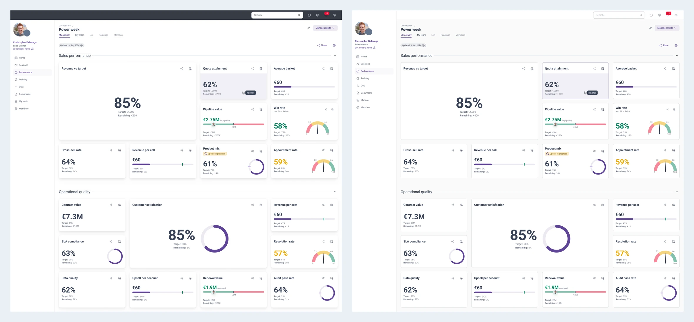
The clearest example is the shell. The old layout ran a full-width top bar across the top of the window with the sidebar hanging below it, which cut the page in two before any content appeared. We moved the logo down into the sidebar, ran the sidebar the full height of the window, and pulled the top bar into the content column where it belongs. One less full-width band, one continuous edge down the left, and the whole app reads lighter and more aired for it. That change is visible in the comparison below and it is the sort of thing a component-by-component migration would never have produced on its own.
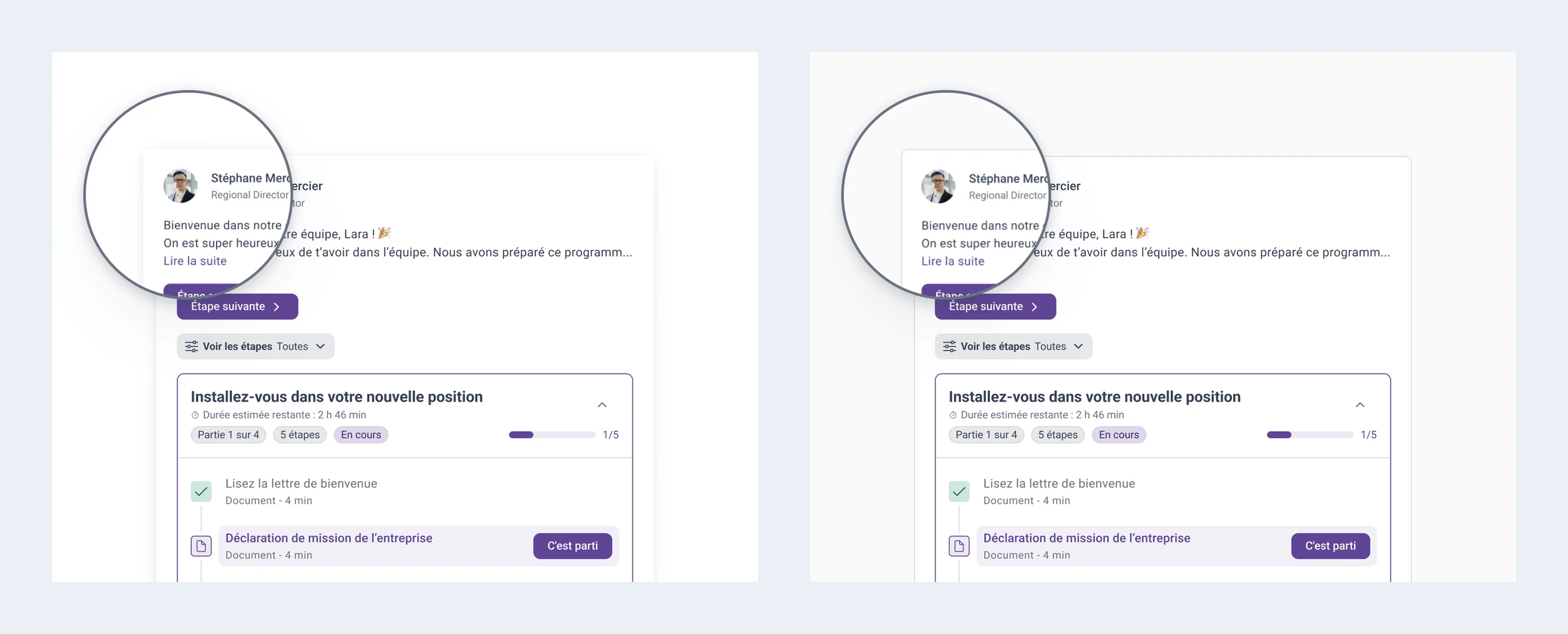
Left, before · Right, after
What did not ship
The roadmap had three phases. Phase one is everything above. Phase two was going to mix each client’s brand hue into the neutral scale, so that the greys the whole interface now rested on belonged to the client rather than to nobody. Phase three was a full token refactor with semantic tokens and a dark theme.
Phase two got as far as a specced implementation ticket in February 2026, and I still think the mechanism was the good part. It is a feature query in the SCSS palette map. The base greys are declared as plain hex custom properties. Then, for browsers that support relative colour syntax, the same custom properties are redeclared in OKLCH, pulling the hue off the theme colour and holding each grey’s own lightness exactly where it was:
:root { --gray-solid-20: #d6d7dc; }

@supports (color: oklch(from red 1 1 1)) {
  :root {
    --gray-solid-20: oklch(from var(--theme-main-color) 0.8798 calc(0.0069 + 0.015) h);
  }
}
The token layer keeps pointing at the custom property, so $gray-solid20 in the SCSS
map resolves to var(--gray-solid-20) and every component that already used the grey
picks up the tinted version without being touched. No JavaScript in the colour path,
no build step, nothing precomputed per tenant, and an old browser silently gets the
flat greys instead of a broken page.
The added chroma is not a constant, and the reason is the only real judgement in the
file. Greys used mainly for text get +0.01, because chroma at those lightnesses
eats into the contrast the text depends on. Greys doing double duty as text and
borders get +0.0125. Borders, backgrounds and disabled text get +0.015, since
they start almost perfectly neutral and need more before the tint reads at all. The
page background gets +0.005, because any more than that on a near-white ground
stops looking like a tint and starts looking like a colour cast.
It was abandoned in March 2026. The review feedback was negative, and the reason was not technical. The team wanted the product to keep feeling neutral rather than personalised with each client’s colour.
What it did not do
The question that outlived the ticket
Tonal structure made the neutral scale carry the load the shadows used to. Twelve steps of grey, each with a job: page ground, card, inset, border, secondary text. That is what turned “whose grey is it?” into a real question instead of a decorative one, and it is why I kept working on the answer after the product stopped wanting it.
The colour side of it has its own case study here: the perceptual arithmetic, why reaching for HSL gets it wrong on some brand hues and not on others, and the instrument I built to check every client’s colour rather than assert that it was fine.
What I would do differently
Cost it, instead of waiting for headcount. The design system study on this site opens with “I did not propose a design system, I costed one.” This epic is the counterexample. It carried no number, so it sat unprioritised for years until a staffing accident freed it. The accessibility finding alone was a prioritisation argument I could have run much earlier and did not.
Plan for the invisibility. A surface modernisation done well is one nobody catches happening. Users get “it feels better” without being able to say why, which is the outcome you want and the worst possible evidence. I knew that going in and still collected the before-and-after casually. A deliberate capture of every migrated screen, plus structured feedback at two or three points in the rollout, would have cost a few days and given this page the section it does not have.