03 — Case study
Prize Challenge Redesign
Sales reps competed for real money, and the screen that told them how they were doing was the most complained-about page in the product. Every type of prize had been drawn its own way, the numbers never said what they counted, and people who were leading their ranking had their points locked by conditions nobody had explained to them.
The problem, measured
Challenges are one of the pillars this product stands on. A challenge puts a group of sales reps in competition over a period, and at the end somebody wins something. Sometimes that is a physical prize. In the type this study is about it is money: points, exchanged for gift cards at retail stores.
One challenge is not one competition, though. It holds mini-challenges, usually
several and sometimes more than ten, each paying points into the same pot. Some are
scored on performance against a target. Some are scored on where you finish in a
ranking. Several carry a sequence of prizes, so first place pays one amount, second
another, fourth through sixth another. And any of them can be gated behind
conditions measured on completely different indicators, which have to clear before
the points are yours. Admins configured all of this themselves, including how much
each mini-challenge was worth, so a card could say 75% du calcul and mean it.
- Mini-challenge 01 score on an indicator · hit a target
- Mini-challenge 02 ranking on an indicator · finish position
- Mini-challenge 03 ranking, in a sequence of prizes 3 prize tiers, one per rank band 2 conditions on other indicators
- … sometimes past ten
None of that was theoretical. The worst configurations I looked at were live ones.
Reps opened this page with two questions: where do I stand, and what do I do next to win. The page held all the data and answered neither. It was the most reliable source of complaints Customer Support handled, year after year, and the complaints kept coming back to the same handful of things.
The pitch
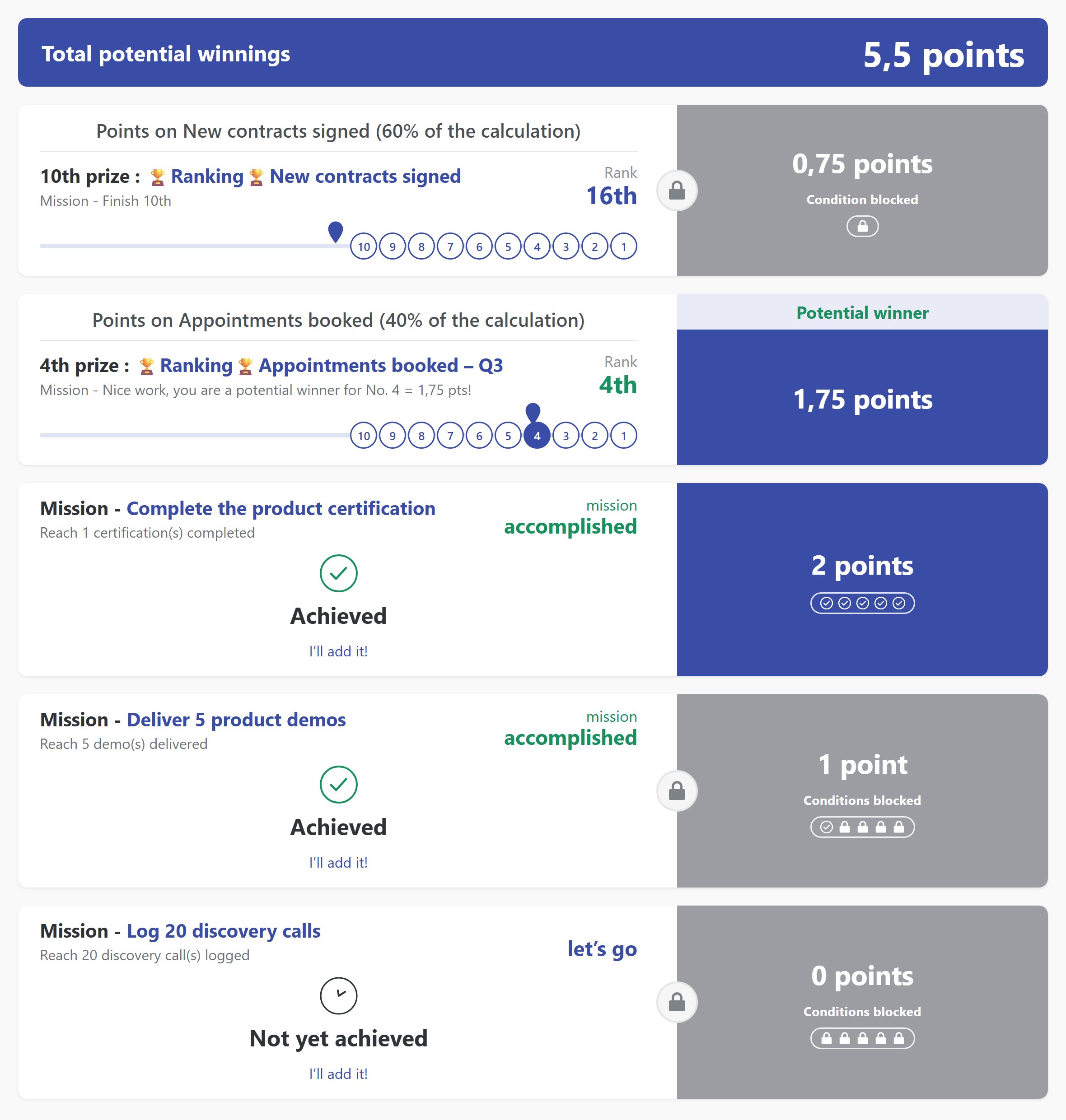
The first problem is the one you see before you read anything. Every type of mini-challenge had been drawn its own way. Score-based ones looked nothing like ranking-based ones, sequences looked like neither, and the conditional variants had grown their own layout again. Scroll a real challenge and no two cards share an anatomy, so you re-learn how to read a card every time you scroll past one.
Then the specifics, which are the things people actually wrote in about.
The big number told you nothing about itself. It was a score on an indicator, and the card never said what that indicator counted or what winning it took.
There was no mission anywhere. Nothing on the card said, in words, what you had to do: finish first, reach ten contracts, beat a number. You inferred it from a progress bar and a rank bubble.
Indicator names and ranking names sat side by side as two links. Rankings are always built on indicators, so the two were frequently the same word printed twice, and when they were not the same they were usually cryptic. Either way you could not tell which one you were being measured on.
Then the one that generated real anger. People were winning and their points were
locked. A rep could be first on the main indicator with 1 point greyed out behind
a padlock, because an unmet condition on some other indicator was blocking it. The
card said “Conditions bloquées” and gave you a row of tiny lock icons. It did not
say which conditions, what they needed, or that they were mandatory rather than
decorative.
A rep could be first in their ranking and see nothing but a padlock.
Underneath all of that, the words “gagnant potentiel” and “gains potentiels” were carrying weight the design gave them no help with. Some people read potential winnings as money already banked. Others never worked out that potential meant provisional.
Before — the score list as it shipped
What I built
Everything got one anatomy. Left side carries the context and where you stand. Right side carries the points, big, with their status attached. Under it, a details area that opens on demand. Score-based, ranking-based, sequenced, conditional: same skeleton, same reading order, differences showing up inside the skeleton instead of as a different card.
That was most of the work, honestly. The rest is what goes in it.
The mission is written down. In plain words, in the details. Mission: finish 1st in [ranking name]. Mission: reach 10 contracts. Nothing to infer from a bar.
The indicator and the ranking stop competing. The details say Based on: [ranking name] and name the indicator separately, so the duplicate-name problem goes away. Next to it, the two numbers people had been working out in their heads: what you have achieved, and the gap to the position above you.
Conditions become a checklist you can act on. Each one gets its own row with the indicator it measures, what it needs, and whether it is done or still locked. The details say outright that the conditions must clear before the points count, which is the sentence that had been missing for years. On the card itself the whole set compresses to a small run of check and lock marks, so you can see at a glance that there are five and two are open.
Prize sequences show the ladder. The track groups ranks the way the prize does,
so 5ᵉ–3ᵉ is one stop rather than three, and the full table of what each rank pays
sits in the details with your position marked. The next stop is the next thing to
aim at.
After — one anatomy, every prize type
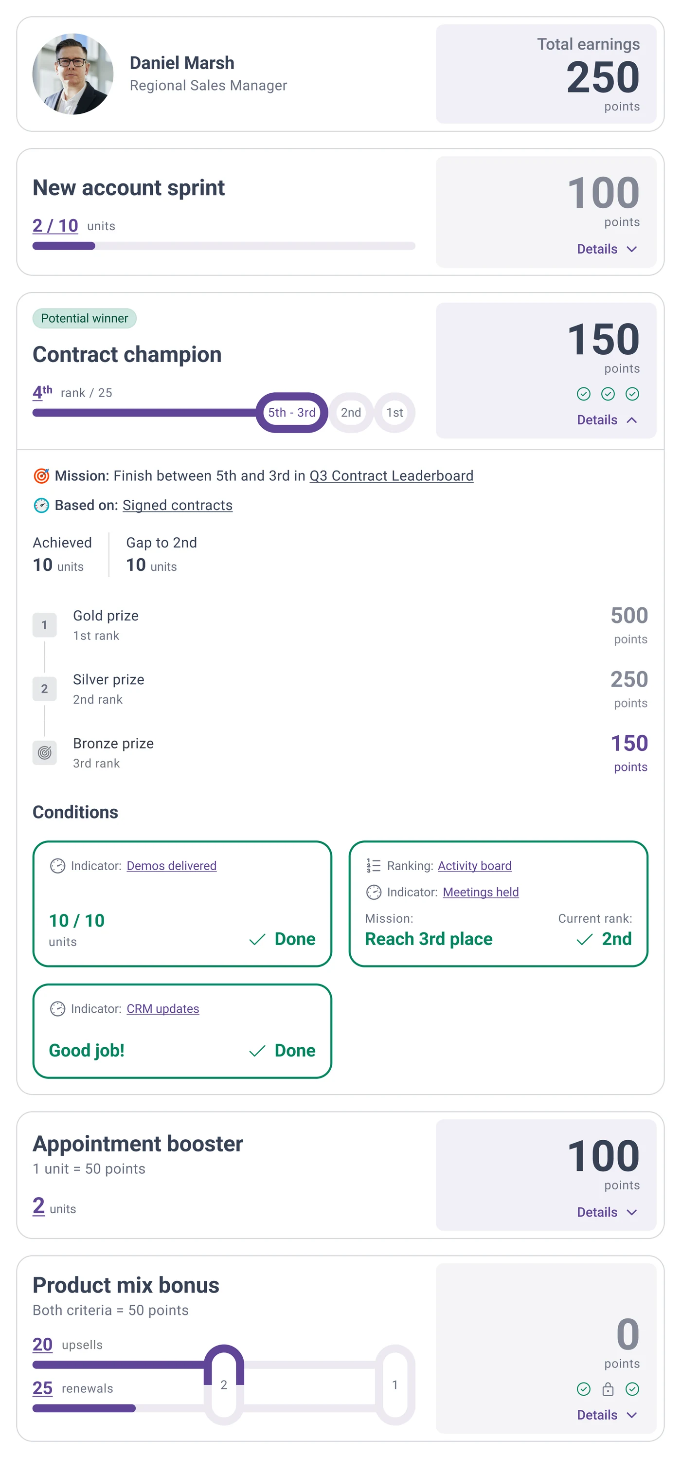
On mobile the details do not open in place. Opening them takes the whole prize box to full screen, because a drawer inside a phone-width card is a squint and this content will not fit in one.
One part matters more than it sounds. This shipped as a design system component with its own guidelines page rather than as a screen, and every prize type in the product renders through it. That is the reason the consistency held after I stopped looking at it.
Tested until it stopped breaking
The structure did not arrive in one go, and the process is the part I would defend in a review.
Crash tests came first: internal sessions with product, developers and Customer Support, where each iteration got loaded with the ugliest configurations running in production and read cold. Customer Support were the best testers in the building. They had spent years translating this page to angry users, so they knew which sentence people would misread and they were not shy about saying so. Every round ended with the information structure changed and another round booked.
After that, the people who actually build these things. We ran moderated tests through Maze with power users at client organisations, the admins who configure the challenges and then field their own reps’ confusion. That pass validated the final structure.
The whole loop, from first proposal to a version that stopped breaking, ran more than six months.
What I am not claiming
It did not manage that alone either. The redesign landed in a product that was being modernised surface by surface at the same time, which is its own case study here. Between them, one of the oldest and most disliked screens in the product became one people stopped mentioning.
What I would do differently
Get prototypes in front of clients in month one. Those six months were not six months of designing. Most of it was waiting: hand-building each testable iteration, booking the internal sessions, then queuing for client availability for Maze rounds that only happened at the end.
Today I would generate the iterations instead of building them by hand. Working prototypes take hours now, so the expensive part, real clients reacting to something real, can start in week one and run the whole way through rather than arriving as a finale. The judgement takes as long as it takes. What collapsed is the distance between having it and finding out whether it survives contact.
This was pre-AI work and I would rather say so than pretend my current workflow was involved. What it does show is the part that has not changed: I will put a design in front of a room of people whose job is to break it, as many times as it takes.